By Volrath2002 - 27 Jul 2014 3:52 PM
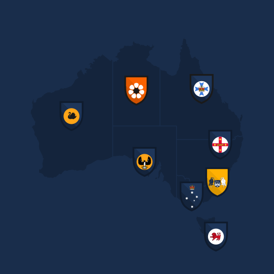
Michael Taylor Design launched a new project this year ( 2015 ) to re-design the A-League and then create a new tiered football system with a second division, the plan for a third division lost pace. In addition, he has added expansion teams to the A-league as requested by "Expand the A-League" Facebook page.
This is the completed project:
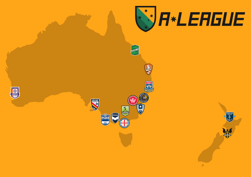
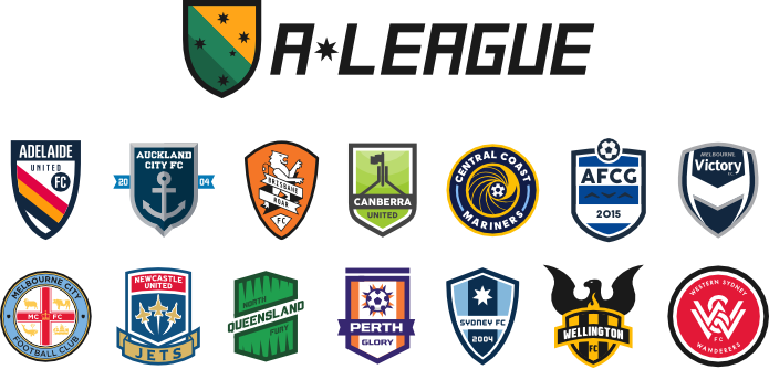
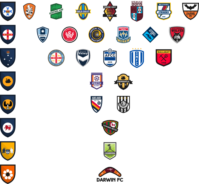
Existing teams:
Central Coast Mariners
Melbourne Victory
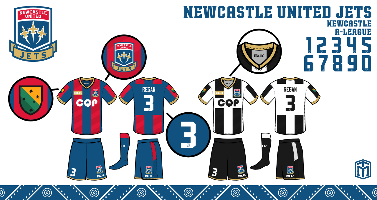
Newcastle United Jets
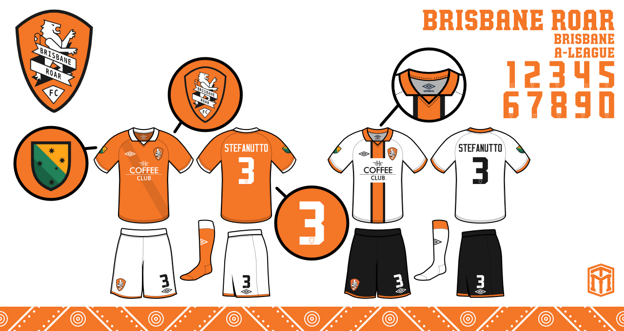
Brisbane Roar
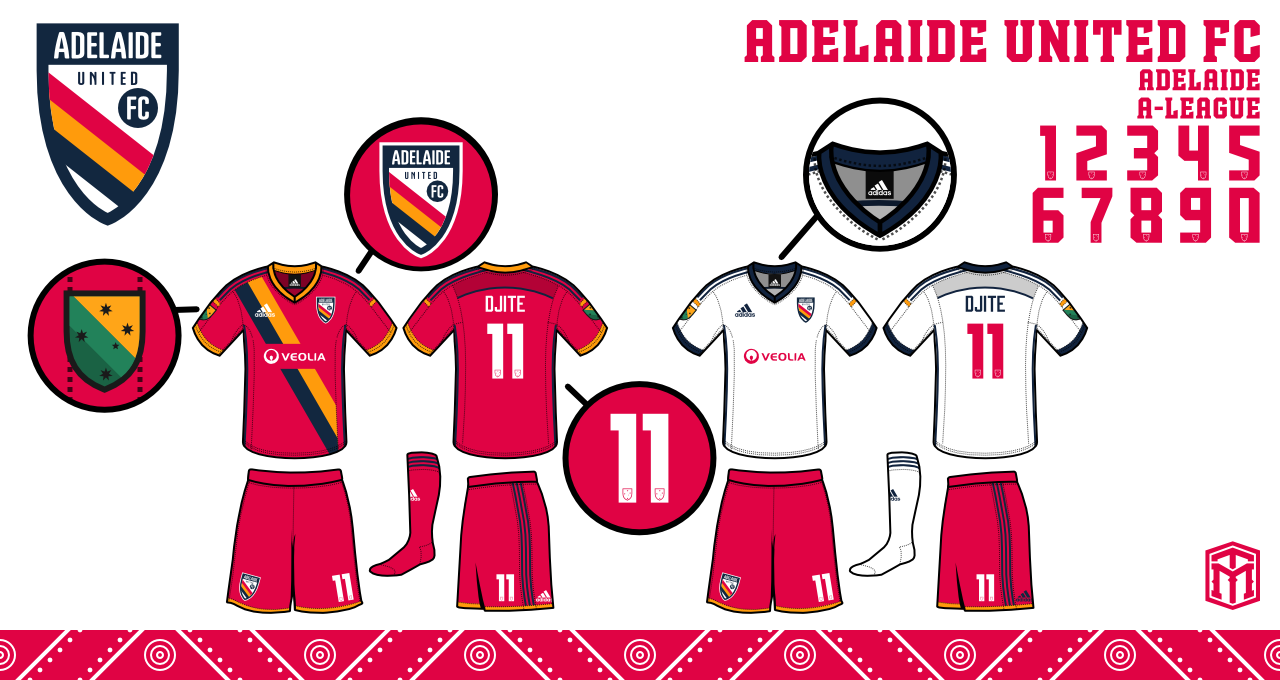
Adelaide United
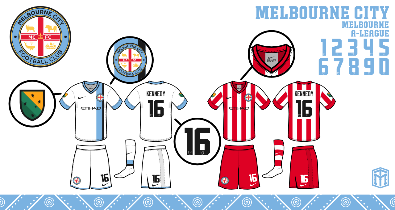
Melbourne City
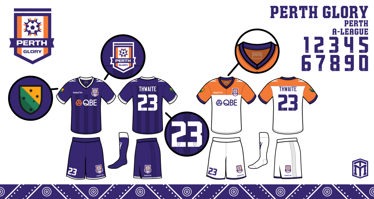
Perth Glory
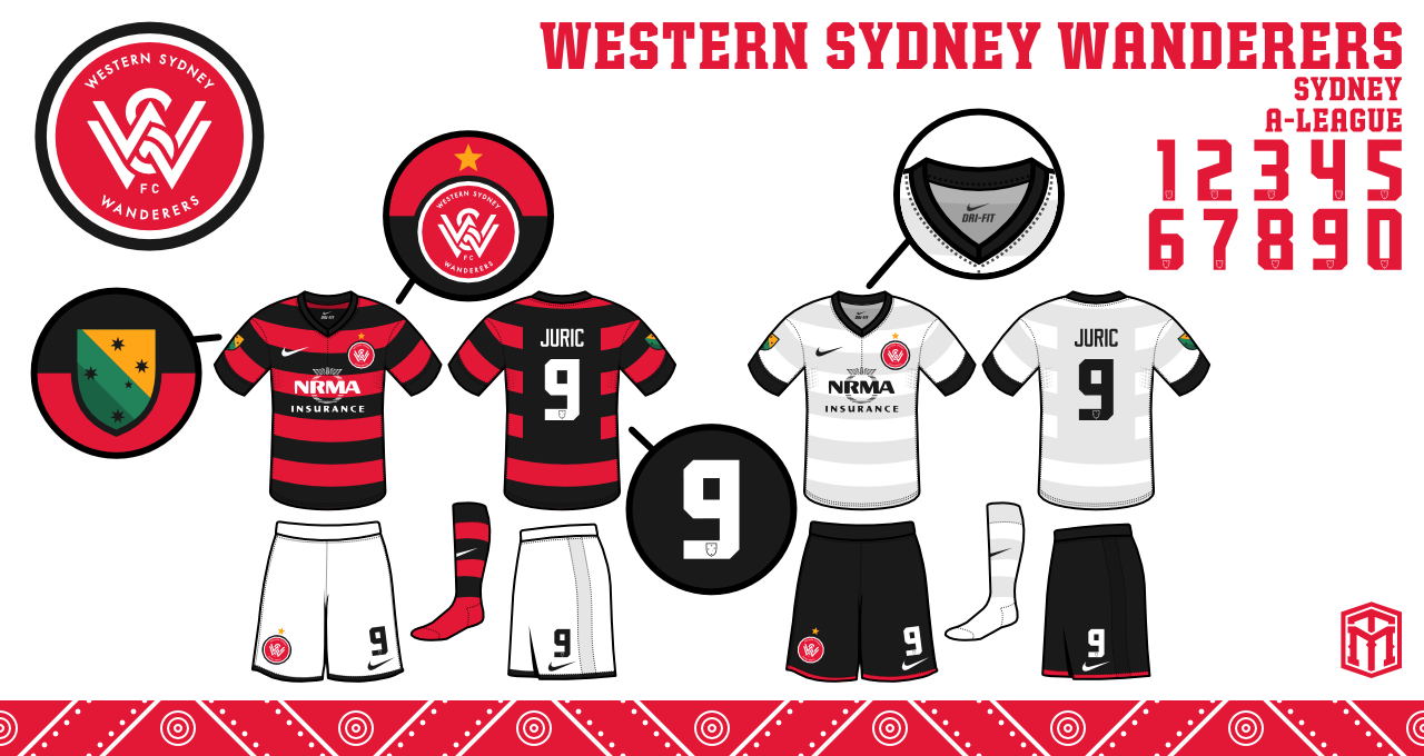
Western Sydney Wanderers
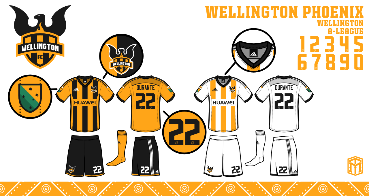
Wellington Phoenix
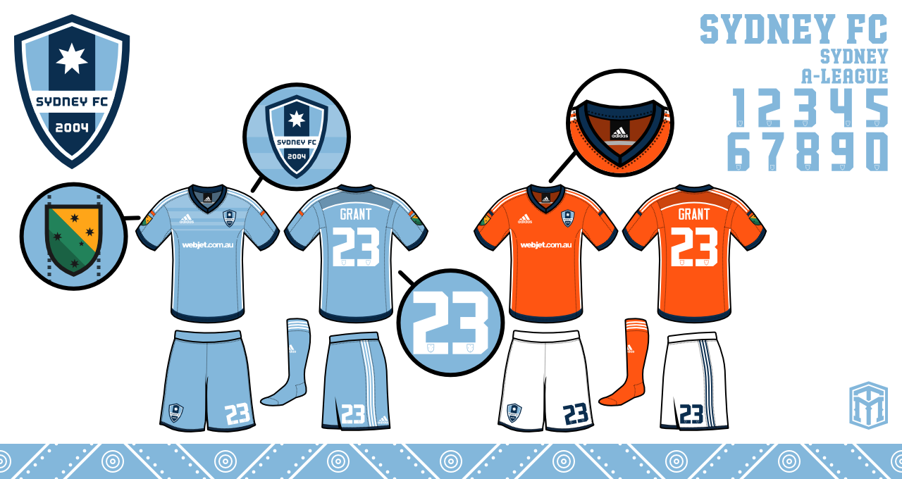
Sydney FC
New teams:
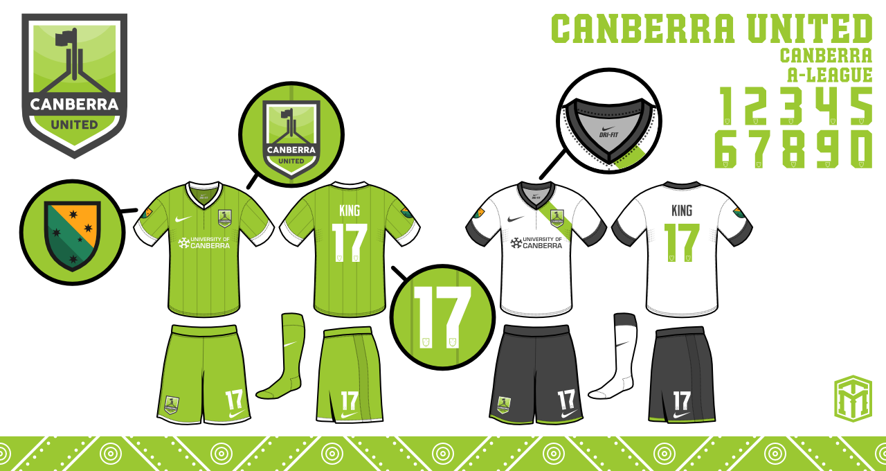
Canberra United
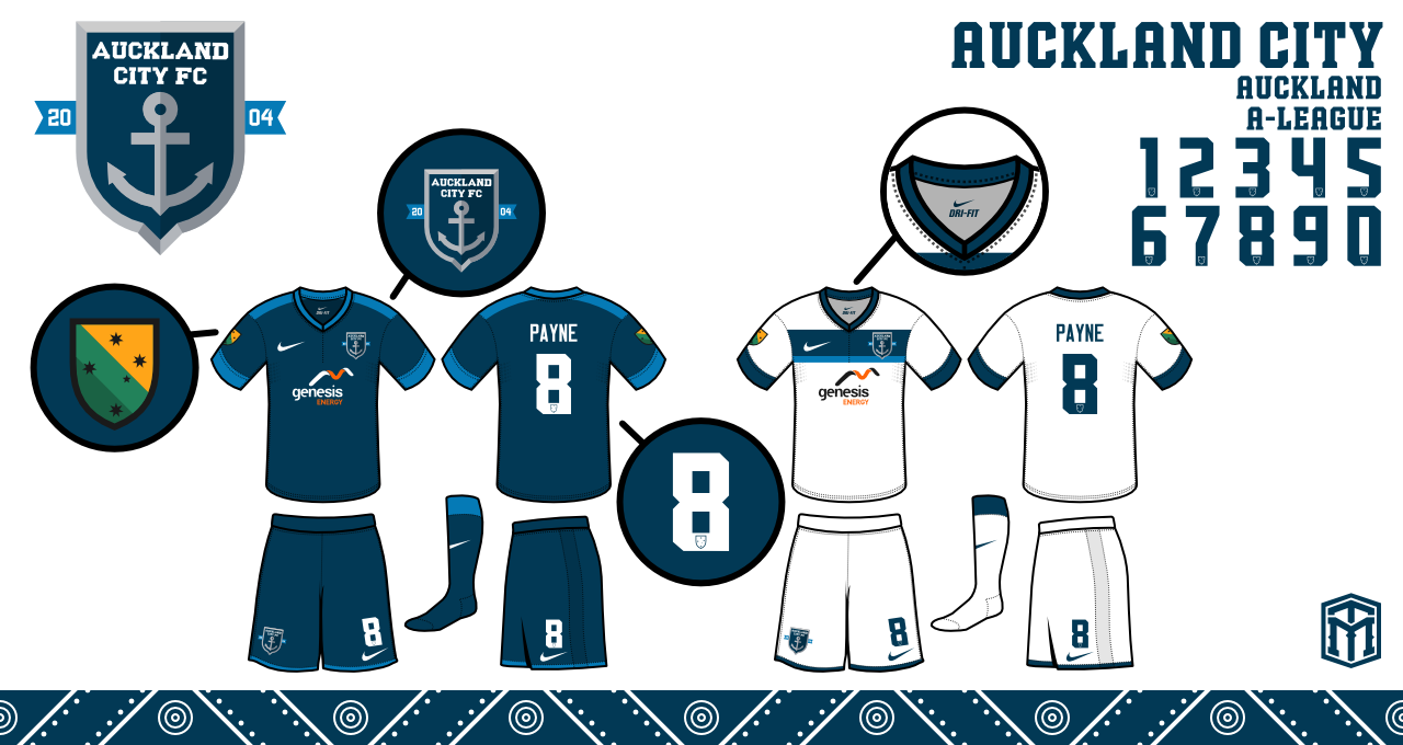
Auckland City
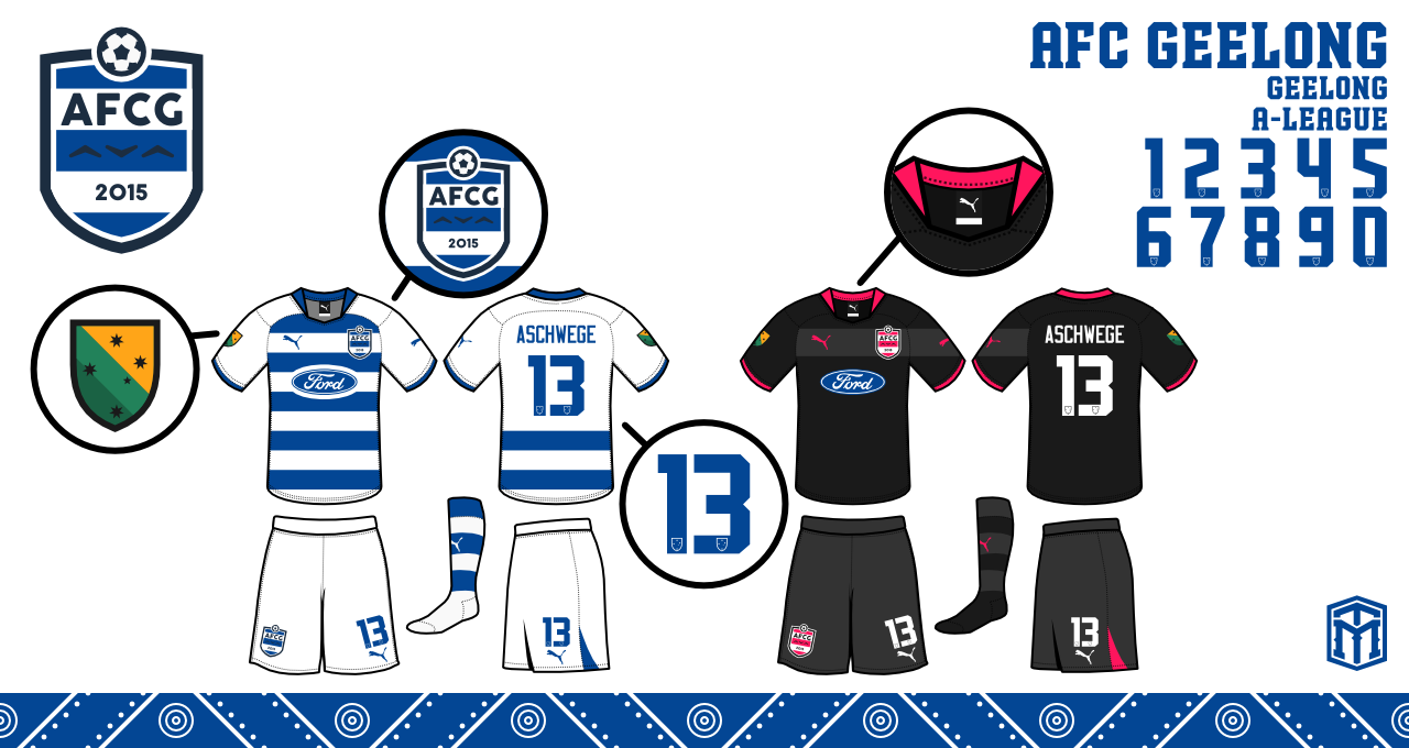
AFC Geelong
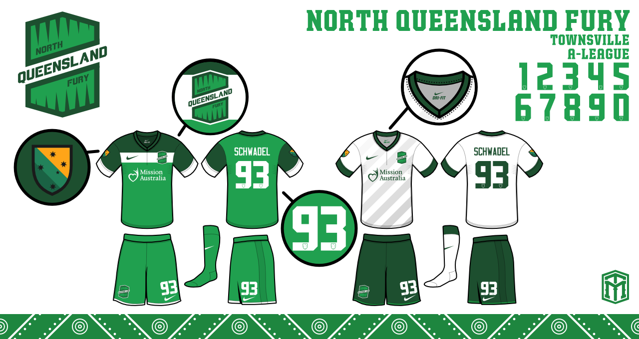
North Queensland Fury

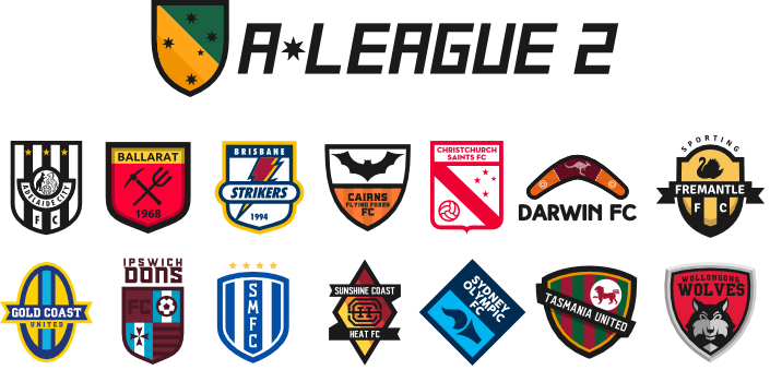
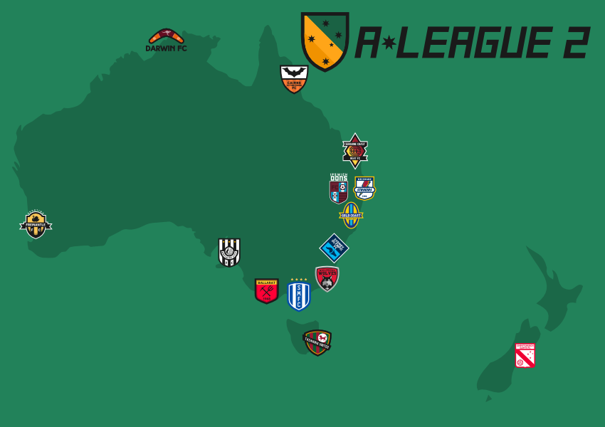
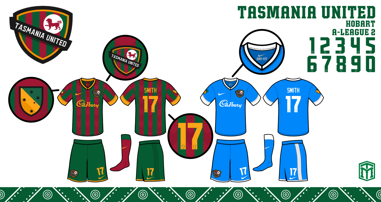
Tasmania United
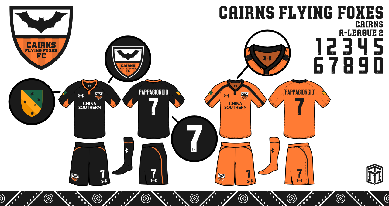
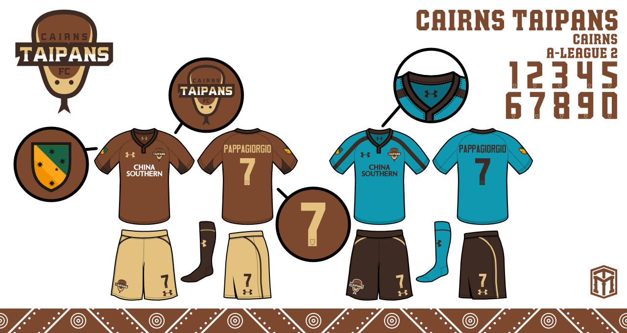
Cairns Flying Foxes ( Was originally going to be Cairns Taipans but changed once designer was aware of the basketball team by the same name )
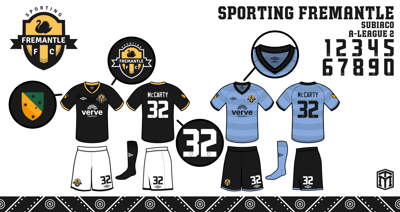
Sporting Fremantle
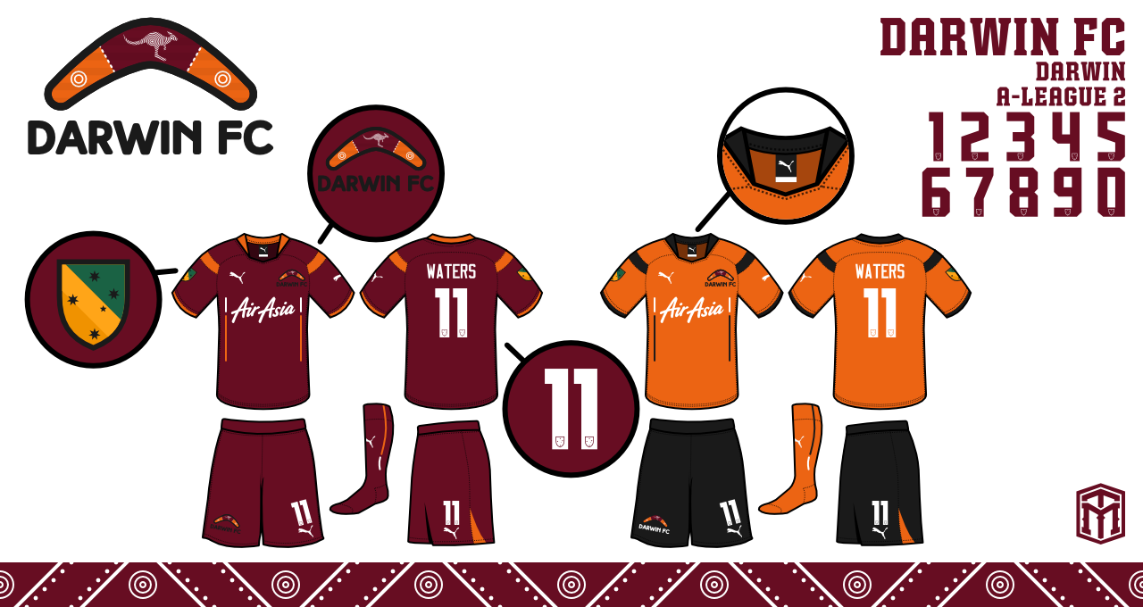
Darwin FC
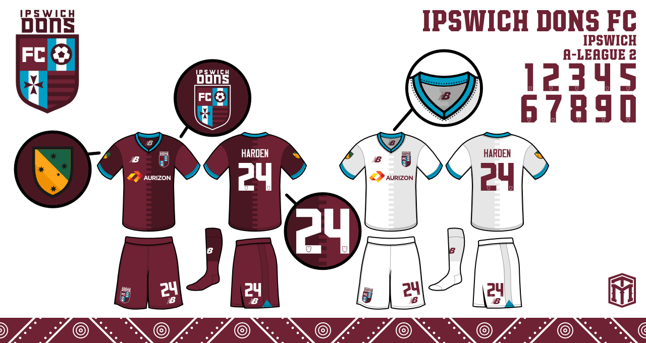
Ipswich Dons
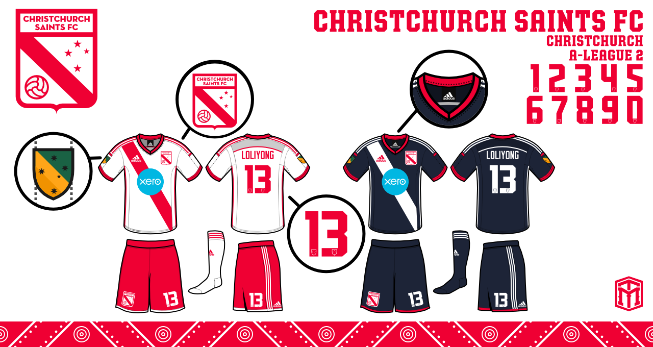
Christchurch Saints
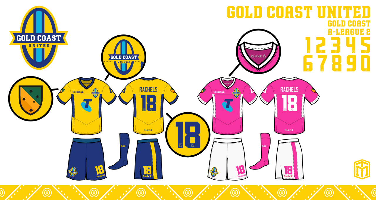
Gold Coast United
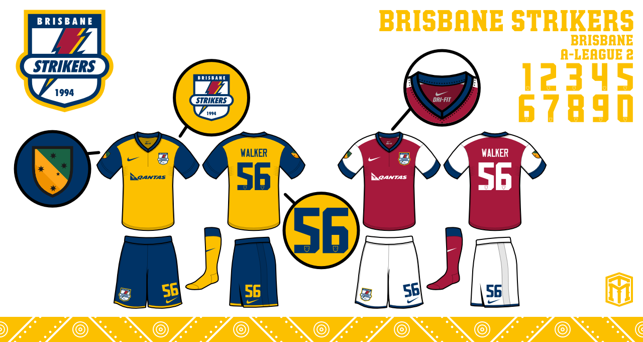
Brisbane Strikers
Sunshine Coast Heat FC

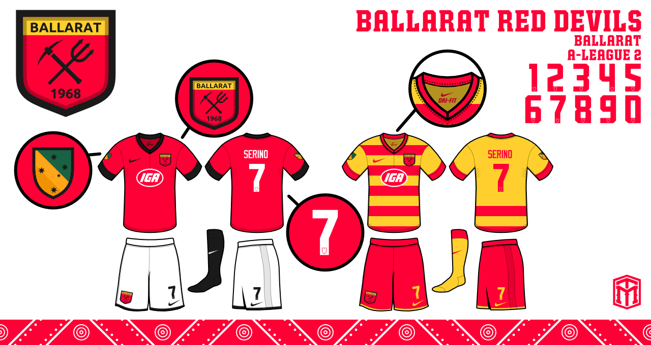
Ballarat Red Devils
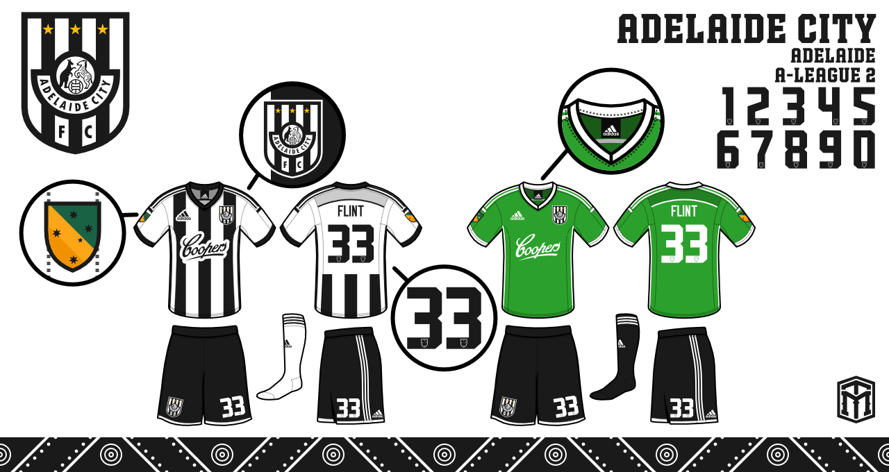
Adelaide City
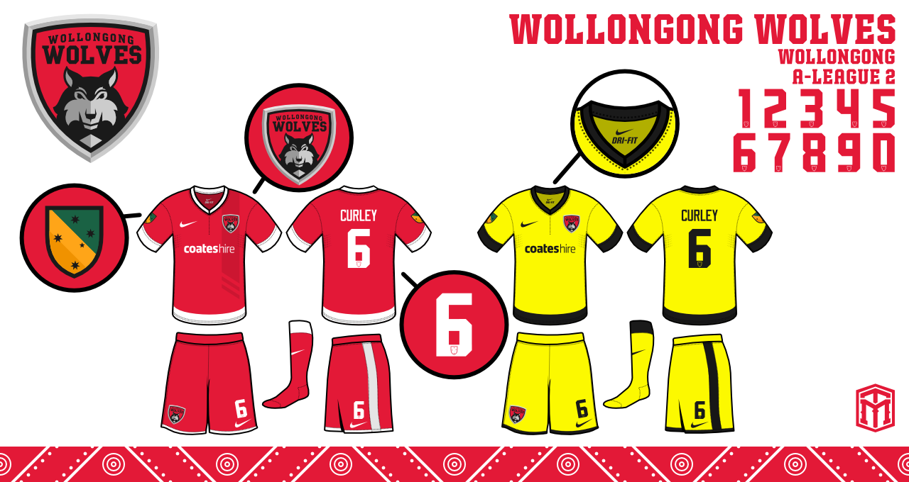
Wollongong Wolves
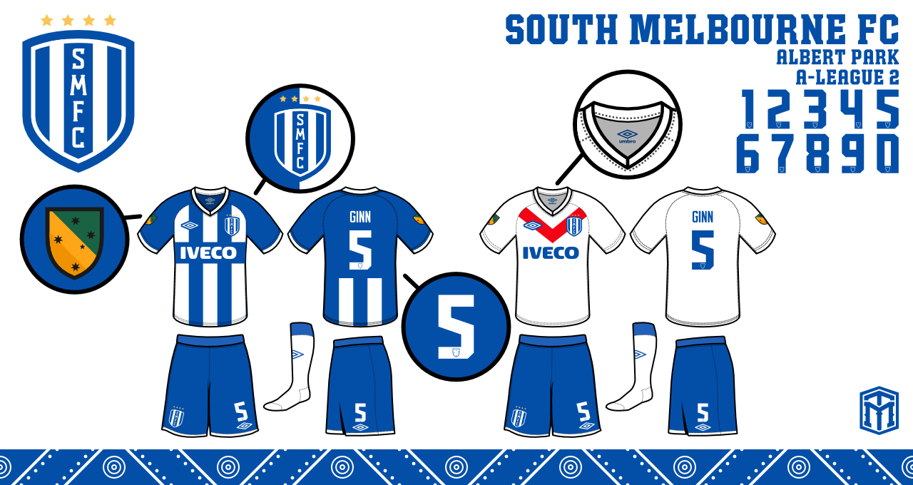
South Melbourne
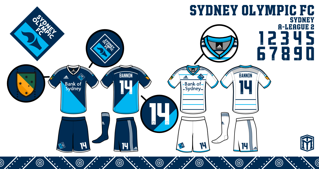
Sydney Olympic FC
Domestic Cups
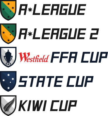
"So this was included in the first post, and some of you really wanted to know about the domestic cups. The top two are the leagues. The Westfield FFA Cup currently exists, and is between all the teams in the A-League and the teams that qualify from the regional leagues. The Kiwi Cup would be a round robin between the 3 New Zealand teams.
But the State Cup is new. I had this idea very early on. The premise would be an 8 team tournament featuring one from each state and territory. The teams would qualify in their own state before the final tournament."
"Here's a breakdown of teams from the two leagues I made. Clearly the top 3 have a tougher time, but it would even out with expanded qualification from lower leagues. Just something I had an idea for, and thought I should share for the finale."
ORIGINAL POST
So following on from the continued interest in the Brisbane Roar crest I thought it might be a nice idea to open a thread that covers more generally the A-League as a whole. So please post any opinions, banter and design ideas for any of the A-league clubs.
One set of redesigns that cought my eye was by Michael Taylor Design ( http://sportslogospot.blogspot.com.au/2013_04_01_archive.html ) before the start of last season ( 2013 ).
He only completed 5 teams and I have asked him if any more are on the way but alas the project is on the backburner.
My personal favs out of what he did would be Central Coast Mariners and Perth Glory.
But the Adelaide United crest I think has too much white, I think the 'United' needs to be larger and put the FC down into the white space. I think it would use the space better and poroduce a better crest overal.
Have a look and tell me what you guys think.
Perth Glory:

"The second team in my series is Perth. Their logo is pretty gradient-astic. There isn’t really imagery for glory, so I took the sun burst and ball and just kinda created around it. I did a vertical oval, took some creative liberties, added the name and year, and thought the final product was pretty good."
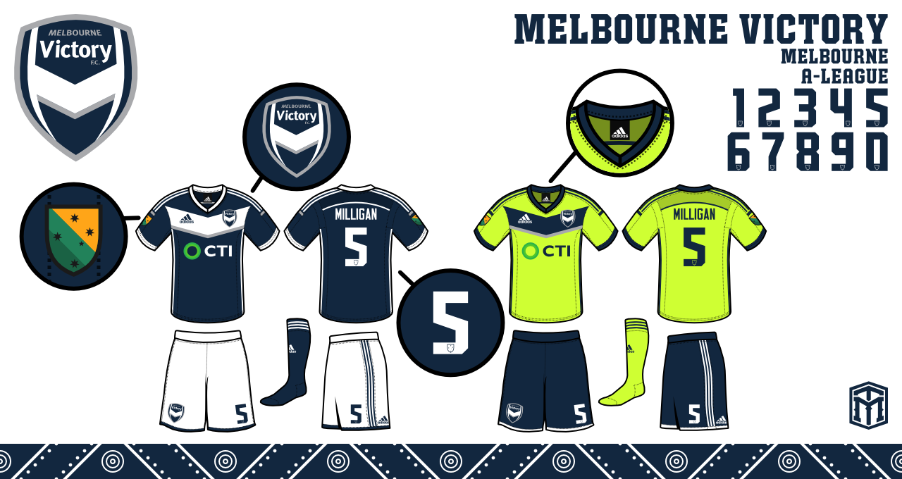
Melbourne Victory:
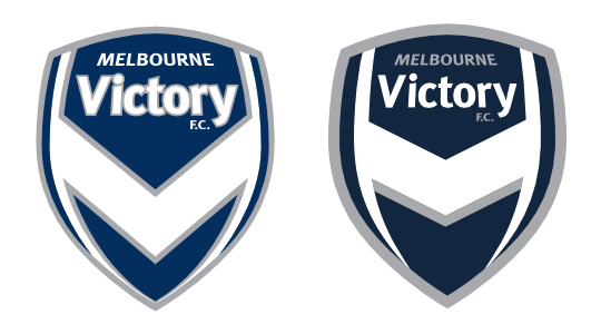
"I feel like the Victory are a few minor tweaks away from a great crest. I cut down on the amount of grey used around the V shape. I took the outlines around the Victory, really just tried to make the whole look fresher."
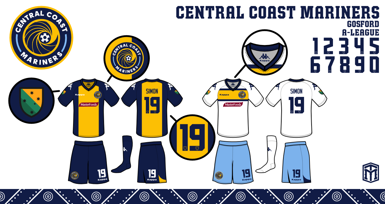
Central Coast Mariners:
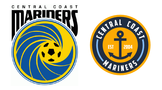
"My 3rd A-League rebrand, this time the newly crowned champions. I wanted to put the logo entirely into a circle, so I ended up with a yellow and navy circle. I used powder blue as another color in addition to the main two. Instead of the wave, I put an anchor."
Newcastle United Jets:

"The crest was a difficult upgrade, because the colors don't work together on how I normally go about logos, with the darker colors always making outlines. I did what I could, and just tried to clean up the look.I adjusted all the colors a little to try and make them pop."
Adelaide United:
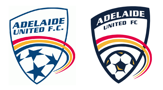
"So this was the first team I did in this series. The logo had a lot of potential, but it needed to not look thrown together. I made the blue bolder, thickened the outlines, and arched the words to make it look like it isn’t slapped on there."
Edited by Volrath2002: 27/7/2014 05:43:50 PM
Edited by volrath2002: 9/7/2015 01:59:42 PM
|
By Volrath2002 - 9 Jul 2015 2:01 PM
The completed set of Michael Taylor Design's redesign of the A-League is now up in full on the first post of the thread. Check it out
|
|