|
ual
|
|
Group: Forum Members
Posts: 4.4K,
Visits: 0
|
Tom AUFC wrote:ual wrote:Has he done Perth Glory logos?
I think the Perth Glory logo looks good, to be honest. Each to their own, I guess.
|
|
|
|
|
|
|
HoldenCaulfield
|
|
Group: Forum Members
Posts: 1.5K,
Visits: 0
|
leftrightout wrote: This would look cool for Brisbane. Edited by leftrightout: 1/9/2011 04:30:50 PM Not enough maroon :P
|
|
|
|
|
barcenal
|
|
Group: Forum Members
Posts: 58,
Visits: 0
|
Your mate has some serious talent (obviously!) and these roar logos are by far the best ones in the 'logos from Iceland' set.
I really like Logo 1 from the new designs. I think the lion head should stay the way it is without the added body bit.
|
|
|
|
|
Tom AUFC
|
|
Group: Forum Members
Posts: 4K,
Visits: 0
|
ual wrote:Has he done Perth Glory logos?
I think the Perth Glory logo looks good, to be honest.
|
|
|
|
|
cgorac
|
|
Group: Forum Members
Posts: 506,
Visits: 0
|
Here are 2 new designs by him with colour change Logo 1  logo 2 
|
|
|
|
|
ual
|
|
Group: Forum Members
Posts: 4.4K,
Visits: 0
|
Has he done Perth Glory logos?
|
|
|
|
|
T3X8
|
|
Group: Forum Members
Posts: 1.7K,
Visits: 0
|
leftrightout wrote:RedTillDead wrote:leftrightout wrote:This would look cool for Brisbane. Edited by leftrightout: 1/9/2011 04:30:50 PM I suspect the Roar fans wouldn't mind the players wearing the kits as well. I would. That's what I was talking about! :lol: That combined with the logo from the iceland dude would be getting a bit too similar to Netherlands, especially considering the FA logo. 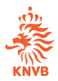
|
|
|
|
|
leftrightout
|
|
Group: Forum Members
Posts: 3.7K,
Visits: 0
|
RedTillDead wrote:leftrightout wrote:This would look cool for Brisbane. Edited by leftrightout: 1/9/2011 04:30:50 PM I suspect the Roar fans wouldn't mind the players wearing the kits as well. I would. That's what I was talking about! :lol:
|
|
|
|
|
RedTillDead
|
|
Group: Forum Members
Posts: 974,
Visits: 0
|
leftrightout wrote:This would look cool for Brisbane. Edited by leftrightout: 1/9/2011 04:30:50 PM I suspect the Roar fans wouldn't mind the players wearing the kits as well. I would.
|
|
|
|
|
leftrightout
|
|
Group: Forum Members
Posts: 3.7K,
Visits: 0
|
This would look cool for Brisbane. Edited by leftrightout: 1/9/2011 04:30:50 PM
|
|
|
|
|
HoldenCaulfield
|
|
Group: Forum Members
Posts: 1.5K,
Visits: 0
|
RedTillDead wrote:rivercitycrew wrote:Maroon will be gone all together this year, so not much point having it in a new logo. Some goes for blue. Kind of think that's a good thing. I always tend to think of it (maroon) more as a RL thing. I like orange. It's not flogged to death and is definitely destinctive. When I mean orange I mean a nice tasteful one :) Not the fluro-vest version you guys had a couple of seasons ago. Used to have to watch the game in sun-glasses :) While the RL boys have appropriated it almost exlusively for themselves in recent years thanks to their marketing efforts, the maroon colour was originally worn on the caps of the queensland representative cricket sides long before rugby league even existed. I would hazard a guess that it was used even prior to that though in some form or another as queensland colour.
|
|
|
|
|
Toffees_or_Roar
|
|
Group: Forum Members
Posts: 1.5K,
Visits: 0
|
martyB wrote:Replace all the blue with black IMO: 1. They don't wear blue anymore; 2. If the training tops are anything to go by, there will be at least black and orange and maybe maroon.  Maybe less white? And I can't see the FFA allowing them to put 1957 since the franchise was started in 2004. Wouldn't mind seeing both though. Otherwise, agree with Tom. Looks good. Edited by martyB: 1/9/2011 02:17:18 AM i think lose the football in the word roar just use an "o", the football makes it a little childish, otherwise its much better than last years:d
|
|
|
|
|
The Frederick
|
|
Group: Forum Members
Posts: 1.7K,
Visits: 0
|
T3X8, that second one isn't a real BL logo, but a fan mockup, IIRC.
I like the OP's logo, but it'd be better without the white part.
|
|
|
|
|
tomw
|
|
Group: Forum Members
Posts: 4.3K,
Visits: 0
|
^ First one is quite good, 3rd one has way too much.
|
|
|
|
|
ccmpete
|
|
Group: Forum Members
Posts: 1.1K,
Visits: 0
|
Gold Coast:    I quite like the first one. Has a retro feel to it.
|
|
|
|
|
T3X8
|
|
Group: Forum Members
Posts: 1.7K,
Visits: 0
|
playmaker11 wrote:I like the design but am I the only one who doesn't like balls in logos, particularly replacing a letter? Not a big fan of it either, but it was pretty much the only part of the original logo that was kept.  Don't mind the original lion graphic in it though. Would be interesting to use that in a revamped logo.
|
|
|
|
|
tomw
|
|
Group: Forum Members
Posts: 4.3K,
Visits: 0
|
119GLORY wrote: training kit looks good though, i like the black socks and shorts, jersey we will just have to wait and see, probably coming out this week methinks! 11.30am Monday.
|
|
|
|
|
RedTillDead
|
|
Group: Forum Members
Posts: 974,
Visits: 0
|
rivercitycrew wrote:Maroon will be gone all together this year, so not much point having it in a new logo. Some goes for blue. Kind of think that's a good thing. I always tend to think of it (maroon) more as a RL thing. I like orange. It's not flogged to death and is definitely destinctive. When I mean orange I mean a nice tasteful one :) Not the fluro-vest version you guys had a couple of seasons ago. Used to have to watch the game in sun-glasses :)
|
|
|
|
|
playmaker11
|
|
Group: Forum Members
Posts: 12K,
Visits: 0
|
I like the design but am I the only one who doesn't like balls in logos, particularly replacing a letter?
By now, American Samoa must have realised that Australias 22-0 win over Tonga two days earlier was no fluke.
|
|
|
|
|
rivercitycrew
|
|
Group: Forum Members
Posts: 93,
Visits: 0
|
Maroon will be gone all together this year, so not much point having it in a new logo. Some goes for blue.
|
|
|
|
|
T3X8
|
|
Group: Forum Members
Posts: 1.7K,
Visits: 0
|
119GLORY wrote:nick1408 wrote:Looks a lot like the Brisbane Lions logo to me 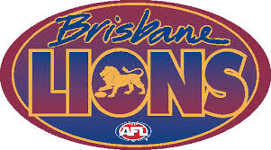 Really? You sure? Anyway, change the Lion to a medieval one like this, and change all colors just to white black and orange, forget the maroon and definately the blue those two look stupid!  That's the old lions logo. Here are the newys.  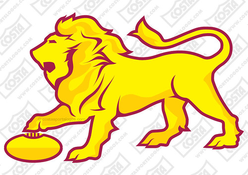
|
|
|
|
|
leftrightout
|
|
Group: Forum Members
Posts: 3.7K,
Visits: 0
|
 This one doesnt look too bas either for Jets fans.
|
|
|
|
|
jonnyb
|
|
Group: Forum Members
Posts: 2.1K,
Visits: 0
|
Not enough Lime Green in it
|
|
|
|
|
Rico[exclamation mark]
|
|
Group: Forum Members
Posts: 749,
Visits: 0
|
119GLORY wrote:nick1408 wrote:Looks a lot like the Brisbane Lions logo to me Really? You sure? Anyway, change the Lion to a medieval one like this, and change all colors just to white black and orange, forget the maroon and definately the blue those two look stupid!  Perhaps referring to this one. I don't see it myself.
|
|
|
|
|
HoldenCaulfield
|
|
Group: Forum Members
Posts: 1.5K,
Visits: 0
|
119GLORY wrote:HoldenCaulfield wrote:119GLORY wrote:nick1408 wrote:Looks a lot like the Brisbane Lions logo to me Really? You sure? Anyway, change the Lion to a medieval one like this, and change all colors just to white black and orange, forget the maroon and definately the blue those two look stupid! HERESY!!!!!!!!! Maroon looks stupid, black white and orange is the way to go imo but i'm not a Roar fan so i'm just stating an opinion, its you blokes that need to tell the club what you want, please don't hate me too much I just personally loathe the strips Roar have come up with until this present point in time! training kit looks good though, i like the black socks and shorts, jersey we will just have to wait and see, probably coming out this week methinks! I don't want to come across as hating on you. Just having a bit of fun. Personally i like the maroon. It means something to we Queenslanders. It is a colour combination that very few other teams have in world football. We are forging our own identity and not copying someone else's. That i believe demonstrates maturity and real growth in football in brisbane. Unlike Gold Coast United's whole "brazil at home, real madrid away" copy-cat crap. Just my opinion though - I'm sure there are some very valid counter arguments too.
|
|
|
|
|
Pr1mo
|
|
Group: Forum Members
Posts: 1.9K,
Visits: 0
|
Can we just have 1 logos from Iceland thread?
|
|
|
|
|
119GLORY
|
|
Group: Forum Members
Posts: 1.8K,
Visits: 0
|
HoldenCaulfield wrote:119GLORY wrote:nick1408 wrote:Looks a lot like the Brisbane Lions logo to me Really? You sure? Anyway, change the Lion to a medieval one like this, and change all colors just to white black and orange, forget the maroon and definately the blue those two look stupid! HERESY!!!!!!!!! Maroon looks stupid, black white and orange is the way to go imo but i'm not a Roar fan so i'm just stating an opinion, its you blokes that need to tell the club what you want, please don't hate me too much I just personally loathe the strips Roar have come up with until this present point in time! training kit looks good though, i like the black socks and shorts, jersey we will just have to wait and see, probably coming out this week methinks!
|
|
|
|
|
Chiso
|
|
Group: Forum Members
Posts: 185,
Visits: 0
|
Wow thats a cracking job, how is he not doing this for the A-League?
|
|
|
|
|
leftrightout
|
|
Group: Forum Members
Posts: 3.7K,
Visits: 0
|
Tom AUFC wrote:martyB wrote:Replace all the blue with black IMO: 1. They don't wear blue anymore; 2. If the training tops are anything to go by, there will be at least black and orange and maybe maroon. Maybe less white? And I can't see the FFA allowing them to put 1957 since the franchise was started in 2004. Wouldn't mind seeing both though. Otherwise, agree with Tom. Looks good. Edited by martyB: 1/9/2011 02:17:18 AM I'm with you there. The black looks good. @cgorac: Please email these to the club and supporter groups, etc. This looks much better than what they currently have, and yet, it maintains everything they currently have. This looks much better IMO. I like this logo much better compared to what they currently have. I would like to see them in a Roma style home top like this... 
|
|
|
|
|
HoldenCaulfield
|
|
Group: Forum Members
Posts: 1.5K,
Visits: 0
|
119GLORY wrote:nick1408 wrote:Looks a lot like the Brisbane Lions logo to me Really? You sure? Anyway, change the Lion to a medieval one like this, and change all colors just to white black and orange, forget the maroon and definately the blue those two look stupid! HERESY!!!!!!!!!
|
|
|
|