|
MarkfromCroydon
|
|
Group: Forum Members
Posts: 1.7K,
Visits: 0
|
Every year, Sydney get closer and closer to their dream of wearing the Melbourne Victory kit.
|
|
|
|
|
|
|
Davide82
|
|
Group: Forum Members
Posts: 12K,
Visits: 0
|
Don't mind it
|
|
|
|
|
Muz
|
|
Group: Forum Members
Posts: 15K,
Visits: 0
|
Good / different.
Member since 2008.
|
|
|
|
|
sub007
|
|
Group: Forum Members
Posts: 9.5K,
Visits: 0
|
|
|
|
|
|
evolution
|
|
Group: Forum Members
Posts: 384,
Visits: 0
|
+xJets ACL kits. I really like them although I think the away one should have blue shorts.  Home kit is solid and if they do sell them I'll be grabbing one. Away kit is weird though, the sash is completely unnecessary and in the wrong direction IMO. Must be trying to reinforce the red and blue image for Newcastle. As much as I love having gold on our kits I'd have ditched it all together and gone for the Crystal Palace away look (with sash in correct direction): 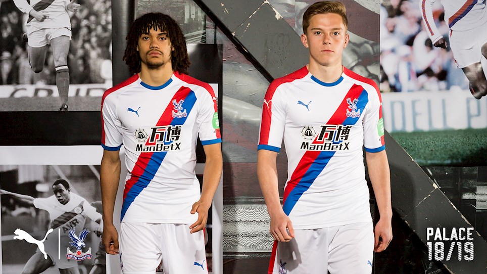
|
|
|
|
|
sub007
|
|
Group: Forum Members
Posts: 9.5K,
Visits: 0
|
Jets ACL kits. I really like them although I think the away one should have blue shorts.
|
|
|
|
|
sub007
|
|
Group: Forum Members
Posts: 9.5K,
Visits: 0
|
 Remembrance round kit worn last week.
|
|
|
|
|
P&R will fix it 2.0
|
|
Group: Forum Members
Posts: 4.8K,
Visits: 0
|
Nicely NCIPPY good timing 
|
|
|
|
|
sub007
|
|
Group: Forum Members
Posts: 9.5K,
Visits: 0
|
 Edit: I'm using my laptop now so I can now post the pic.
|
|
|
|
|
El-Telepathy
|
|
Group: Forum Members
Posts: 69,
Visits: 0
|
Looks nice on telly, its growing on me more, shame it hasn't helped their form.... 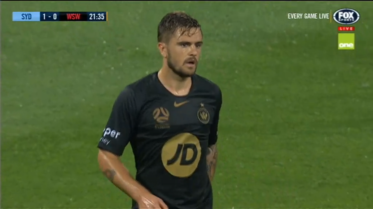
|
|
|
|
|
robstazzz
|
|
Group: Forum Members
Posts: 5.4K,
Visits: 0
|
I love our 3rd kit the way it is but wish the JD had been done in gold instead of the backdrop, with the gold circle around it. I think that would have been way better.
|
|
|
|
|
El-Telepathy
|
|
Group: Forum Members
Posts: 69,
Visits: 0
|
+x+xThis shirt is sick. This is the best WSW shirt ever by an absolute mile. I am surprised every time a plain black shirt comes out how much fans love them. it's a plain black shirt for crying out loud. There's nothing special about it. No cutting edge design or striking new colour. I think the plain black shirts are just meh! But then again, we each have our own preferences. Too true, considering Nike put a bit of effort into some other black kits 
|
|
|
|
|
MarkfromCroydon
|
|
Group: Forum Members
Posts: 1.7K,
Visits: 0
|
+xThis shirt is sick. This is the best WSW shirt ever by an absolute mile. I am surprised every time a plain black shirt comes out how much fans love them. it's a plain black shirt for crying out loud. There's nothing special about it. No cutting edge design or striking new colour. I think the plain black shirts are just meh! But then again, we each have our own preferences.
|
|
|
|
|
El-Telepathy
|
|
Group: Forum Members
Posts: 69,
Visits: 0
|
+x
The more i look at this... damn
in my opinion id have black hoops with the kit as well. thats the only thing i'll add
Jeez, it's pretty sharp, love the hoops idea, have to admit it's basically just a plain black, nike's got a lot of great texture and pattern stuff going on at the moment and there's just nothing in this, still looks decent though. interesting that it's the first third kit to have a single colored a-league badge without the club's colours, surprised the other's haven't adopted this
|
|
|
|
|
HeyItsRobbie
|
|
Group: Forum Members
Posts: 6.5K,
Visits: 0
|
+xI'm sorry but the big ass JD logo ruins it for me, its always the main logos that make or break a shirt. agree. if they swapped colours on the logo, it'll be perfect.
|
|
|
|
|
WSF
|
|
Group: Forum Members
Posts: 4.6K,
Visits: 0
|
I'm sorry but the big ass JD logo ruins it for me, its always the main logos that make or break a shirt.
|
|
|
|
|
HeyItsRobbie
|
|
Group: Forum Members
Posts: 6.5K,
Visits: 0
|
The more i look at this... damn
in my opinion id have black hoops with the kit as well. thats the only thing i'll add
|
|
|
|
|
Bullion
|
|
Group: Forum Members
Posts: 1.8K,
Visits: 0
|
Champions badge but no premiers badge?
|
|
|
|
|
azzaMVFC
|
|
Group: Forum Members
Posts: 6.3K,
Visits: 0
|
Thanks Victory.. almost the worst kits in the league
|
|
|
|
|
bohemia
|
|
Group: Forum Members
Posts: 8.3K,
Visits: 0
|
Keen to see how this shirt would look on a footballer
|
|
|
|
|
sub007
|
|
Group: Forum Members
Posts: 9.5K,
Visits: 0
|
This shirt is sick. This is the best WSW shirt ever by an absolute mile.
|
|
|
|
|
sub007
|
|
Group: Forum Members
Posts: 9.5K,
Visits: 0
|
|
|
|
|
|
sub007
|
|
Group: Forum Members
Posts: 9.5K,
Visits: 0
|
|
|
|
|
|
robstazzz
|
|
Group: Forum Members
Posts: 5.4K,
Visits: 0
|
+xWanderers home kit is the best kit of any A League team of any season.Groundbreaking, looks good and still keeps tradition. Really? I think it looks shit in pictures, maybe it'll grow on me but so far I'm not into it.
|
|
|
|
|
MarkfromCroydon
|
|
Group: Forum Members
Posts: 1.7K,
Visits: 0
|
Wanderers home kit is the best kit of any A League team of any season.
Groundbreaking, looks good and still keeps tradition.
|
|
|
|
|
scubaroo
|
|
Group: Forum Members
Posts: 2.8K,
Visits: 0
|
+xAll of them are solid BUT: - Victory's Bar-code is still iffy to look at - I've never liked Perth having white arms on their home kit, all purple is more eye-catching - gypos kit is half-nice. They probs made it look like a faulty-printer look to differentiate from the Nix hit. (What's wrong with all-yellow?) As a Chelsea fan I love Newy's dark blue. Adelaide are simple and effective. Nux look solid. City are a bit boring but what can you do with really sky-blue? Sydney look good with the navy blue shorts and trims. WSW are nice. My fave is Brisbane's: darker orange with black shorts/trimmings is a really good combination, better than the fluro-futsal team look they had last year. With you on perths. Cannot stand the white sleeves! Victorys is slowly growing on me, especially with the much simpler metricon logo it balances the shirt well, considering how busy it could have been with the optislim/ optifast bullshit.
|
|
|
|
|
HeyItsRobbie
|
|
Group: Forum Members
Posts: 6.5K,
Visits: 0
|
missed opportunity for WSW to go with hooped socks in my opinion
|
|
|
|
|
marconi101
|
|
Group: Forum Members
Posts: 16K,
Visits: 0
|
All of them are solid BUT: - Victory's Bar-code is still iffy to look at - I've never liked Perth having white arms on their home kit, all purple is more eye-catching - gypos kit is half-nice. They probs made it look like a faulty-printer look to differentiate from the Nix hit. (What's wrong with all-yellow?) As a Chelsea fan I love Newy's dark blue. Adelaide are simple and effective. Nux look solid. City are a bit boring but what can you do with really sky-blue? Sydney look good with the navy blue shorts and trims. WSW are nice. My fave is Brisbane's: darker orange with black shorts/trimmings is a really good combination, better than the fluro-futsal team look they had last year.
He was a man of specific quirks. He believed that all meals should be earned through physical effort. He also contended, zealously like a drunk with a political point, that the third dimension would not be possible if it werent for the existence of water.
|
|
|
|
|
HeyItsRobbie
|
|
Group: Forum Members
Posts: 6.5K,
Visits: 0
|
interesting to know WSW went with red socks in their home kit as seen in this picture 
|
|
|
|
|
MarkfromCroydon
|
|
Group: Forum Members
Posts: 1.7K,
Visits: 0
|
 Just brought my new Velez kit. Feeling cool, but not as cool as these guys..
|
|
|
|