|
Monoethnic Social Club
|
|
Group: Forum Members
Posts: 11K,
Visits: 0
|
+xIs it just me or do all indigenous kits, of pretty much any sport, all look pretty similar? I find them all a bit meh. “Playing football is our core. However, we are a community club and therefore it’s important for us to acknowledge and respect the many cultures and beliefs that reflect both the people within our club, as well as our Brisbane Roar fans and their communities,” Patafta said. Does that mean there will be a different "tribute" kit to represent all the other communities every round or is this just platitudes?
|
|
|
|
|
|
|
Keeper66
|
|
Group: Forum Members
Posts: 1.8K,
Visits: 0
|
Is it just me or do all indigenous kits, of pretty much any sport, all look pretty similar? I find them all a bit meh.
|
|
|
|
|
johnszasz
|
|
Group: Forum Members
Posts: 28K,
Visits: 0
|
|
|
|
|
|
tsf
|
|
Group: Forum Members
Posts: 14K,
Visits: 0
|
+xBetter NOT get on a bus in Melbourne wearing the last one, someone might sit in your lap by mistake ....... hahahahahah Would genuinely be a great idea for a third kit and probably would be a collector's item
|
|
|
|
|
Monoethnic Social Club
|
|
Group: Forum Members
Posts: 11K,
Visits: 0
|
Better NOT get on a bus in Melbourne wearing the last one, someone might sit in your lap by mistake ....... hahahahahah
|
|
|
|
|
sub007
|
|
Group: Forum Members
Posts: 9.5K,
Visits: 0
|
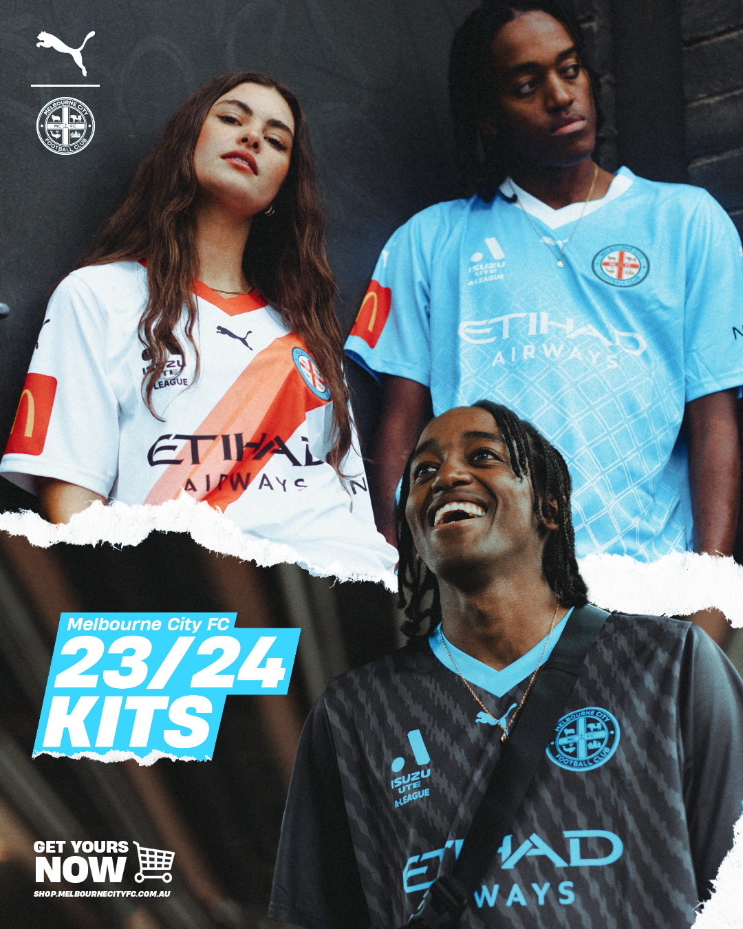 3 solid kits. Love a sash
|
|
|
|
|
sub007
|
|
Group: Forum Members
Posts: 9.5K,
Visits: 0
|
|
|
|
|
|
sub007
|
|
Group: Forum Members
Posts: 9.5K,
Visits: 0
|
|
|
|
|
|
Monoethnic Social Club
|
|
Group: Forum Members
Posts: 11K,
Visits: 0
|
+x+xNice ethnic artwork there.... its OK to put a foreign cultures "art" on an Australian Football shirt if its not South/Eastern European .... that would be really bad... really really evil and all that. https://en.wikipedia.org/wiki/Moriori_genocide I have no issue with relevant cultural art on jerseys. I've been working on a little mini-mod for FIFA/EA FC to have all the NPL1-2 kits from ACT, and finding and learning about things like the Croatian pleter, or Vergina sun for the Macedonian club here has been interesting The Balkans certainly are an "interesting" place in general... Happy learning :) Vergina Sun is a particular doozy (obviously depends on who you ask and which time of day?) what was a common motif on Hellenistic art from 4th and 5th centuries before Christ was politicised heavily by the Greek state after the treasury of Virgina was found in Macedonia in the late 70s and the Sun symbol became a source of regional Macedonian identity despite any proof it ever was in antiquity. Of course when our Commie friends over the border in Yugoslavia got wind of this it was *cough cough "adopted" by the IMRO and became a symbol of Slav-Macedonian nationalism. For some reason they preferred to pretend they had links with ancient Greek history rather than their ethnic Bulgarian ancestry????.....
|
|
|
|
|
NicCarBel
|
|
Group: Forum Members
Posts: 3K,
Visits: 0
|
+xNice ethnic artwork there.... its OK to put a foreign cultures "art" on an Australian Football shirt if its not South/Eastern European .... that would be really bad... really really evil and all that. https://en.wikipedia.org/wiki/Moriori_genocide I have no issue with relevant cultural art on jerseys. I've been working on a little mini-mod for FIFA/EA FC to have all the NPL1-2 kits from ACT, and finding and learning about things like the Croatian pleter, or Vergina sun for the Macedonian club here has been interesting
|
|
|
|
|
Monoethnic Social Club
|
|
Group: Forum Members
Posts: 11K,
Visits: 0
|
I cant quite read who the Womens team's sponsor is, maybe they should have made the font a bit bigger :) ..... jokes....
|
|
|
|
|
sub007
|
|
Group: Forum Members
Posts: 9.5K,
Visits: 0
|
|
|
|
|
|
sub007
|
|
Group: Forum Members
Posts: 9.5K,
Visits: 0
|
Macarthur's kit is class
|
|
|
|
|
Craegus
|
|
Group: Forum Members
Posts: 22,
Visits: 0
|
Macarthur FC Home kit  
|
|
|
|
|
Feed_The_Brox
|
|
Group: Forum Members
Posts: 3.3K,
Visits: 0
|
I don't hate it, but its just gotta have the chevron.
|
|
|
|
|
someguyjc
|
|
Group: Forum Members
Posts: 4.1K,
Visits: 0
|
+xAre you sure someone’s mum didn’t wash the real (white) away strip with a pair of red socks? Definitely looks like it. This would be designed with the youth segment as the target audience. Definitely a colour that would be popular with the 15-24 age group. A mate's 17 yr old son has already bought one. First time his son was eager to get a top before the season started.
|
|
|
|
|
clockwork orange
|
|
Group: Forum Members
Posts: 8.3K,
Visits: 0
|
+xMV Away Kit 23/24    The pink represents the Epacris Impressa flower which is Victorias floral emblem. Are you sure someone’s mum didn’t wash the real (white) away strip with a pair of red socks?
|
|
|
|
|
Monoethnic Social Club
|
|
Group: Forum Members
Posts: 11K,
Visits: 0
|
Nice ethnic artwork there.... its OK to put a foreign cultures "art" on an Australian Football shirt if its not South/Eastern European .... that would be really bad... really really evil and all that. https://en.wikipedia.org/wiki/Moriori_genocide
|
|
|
|
|
Monoethnic Social Club
|
|
Group: Forum Members
Posts: 11K,
Visits: 0
|
+xI wonder if anyone in the design department considers that we have a traditional mediaeval-looking, lion rampart as our emblem (from when they decided we needed to pretend to be a club with 100 year history) combined with a ‘modern’ abstract grease splotch jersey. Talk about schizophrenic. C'mon man, your design department clearly spent some time in the Army and went to a few raves on the weekends :P Orange Camo is also pretty 90s retro btw so I guess there is that :P
|
|
|
|
|
clockwork orange
|
|
Group: Forum Members
Posts: 8.3K,
Visits: 0
|
I wonder if anyone in the design department considers that we have a traditional mediaeval-looking, lion rampart as our emblem (from when they decided we needed to pretend to be a club with 100 year history) combined with a ‘modern’ abstract grease splotch jersey. Talk about schizophrenic.
|
|
|
|
|
griff1
|
|
Group: Forum Members
Posts: 674,
Visits: 0
|
+x+xEach to his own I suppose. But I reckon that orange thing is one of the worst kits I’ve ever seen. Looks like someone’s just flicked some used engine oil at a plain orange shirt. Why can we never have orange with black pinstripes. I remember a few years back (2015/16) Hull City had an orange kit with black pin stripes and black sleeves, and I remember thinking at the time 'why doesn't Roar mimic that kit?' Seems like a perfect fit. Personally I reckon home kits should always be fairly traditional. Keep them simple and don't deviate too far from the core look. However, I reckon away/alt kits should always be a bit more out there and experimental. Roar seems to have done the opposite this time around. I like that for a formula also, go wacky with the away kits!
|
|
|
|
|
someguyjc
|
|
Group: Forum Members
Posts: 4.1K,
Visits: 0
|
+xEach to his own I suppose. But I reckon that orange thing is one of the worst kits I’ve ever seen. Looks like someone’s just flicked some used engine oil at a plain orange shirt. Why can we never have orange with black pinstripes. I remember a few years back (2015/16) Hull City had an orange kit with black pin stripes and black sleeves, and I remember thinking at the time 'why doesn't Roar mimic that kit?' Seems like a perfect fit. Personally I reckon home kits should always be fairly traditional. Keep them simple and don't deviate too far from the core look. However, I reckon away/alt kits should always be a bit more out there and experimental. Roar seems to have done the opposite this time around.
|
|
|
|
|
Monoethnic Social Club
|
|
Group: Forum Members
Posts: 11K,
Visits: 0
|
+xEach to his own I suppose. But I reckon that orange thing is one of the worst kits I’ve ever seen. Looks like someone’s just flicked some used engine oil at a plain orange shirt. Why can we never have orange with black pinstripes. Black away shirt with orange pinstripe and collar/sleeve detail (like the white kit) would be a great shirt......
|
|
|
|
|
LFC.
|
|
Group: Forum Members
Posts: 13K,
Visits: 0
|
yer I agree, these camo look designs sometimes just don't do it at all and the BR one looks meh. The 2nd white kit proves it no doubt the KISS classic principle looks good. The black is just plain nothing, maybe if the orange criss cross stiching was larger would make it more effective looking and stand out little more.
Love Football
|
|
|
|
|
clockwork orange
|
|
Group: Forum Members
Posts: 8.3K,
Visits: 0
|
Each to his own I suppose. But I reckon that orange thing is one of the worst kits I’ve ever seen. Looks like someone’s just flicked some used engine oil at a plain orange shirt. Why can we never have orange with black pinstripes.
|
|
|
|
|
Muz
|
|
Group: Forum Members
Posts: 15K,
Visits: 0
|
Orange great, black good, white ordinary.
Member since 2008.
|
|
|
|
|
sub007
|
|
Group: Forum Members
Posts: 9.5K,
Visits: 0
|
|
|
|
|
|
Muz
|
|
Group: Forum Members
Posts: 15K,
Visits: 0
|
Yeah how good. Black is particularly mint.
Member since 2008.
|
|
|
|
|
NicCarBel
|
|
Group: Forum Members
Posts: 3K,
Visits: 0
|
|
|
|
|
|
sub007
|
|
Group: Forum Members
Posts: 9.5K,
Visits: 0
|
|
|
|
|