|
T3X8
|
|
Group: Forum Members
Posts: 1.7K,
Visits: 0
|
Roar_Brisbane wrote:Roar in me Blood wrote:The end of the banner (jetpack) doesn't work with the V shaped end of that ribbon FFS.
Proof of concept? Proof of alcohol.
I'm calling BS on this logo now - but having said that, there are people with crossed out Queensland Roar tats on their butts that are getting very worried.
I like our logo - because it's our logo. With you on that. +1 If this is a change it has to still have some resemblance to the current one.
|
|
|
|
|
|
|
Roar_Brisbane
|
|
Group: Forum Members
Posts: 14K,
Visits: 0
|
Roar in me Blood wrote:The end of the banner (jetpack) doesn't work with the V shaped end of that ribbon FFS.
Proof of concept? Proof of alcohol.
I'm calling BS on this logo now - but having said that, there are people with crossed out Queensland Roar tats on their butts that are getting very worried.
I like our logo - because it's our logo. With you on that.
|
|
|
|
|
clockwork orange
|
|
Group: Forum Members
Posts: 8.3K,
Visits: 0
|
Ryan's Rovers wrote:sobkowski wrote:extremely basic mods
my guess is that the jetpack scroll was added to fill in the empty space ? Isn't that the lion's tail? good call.
|
|
|
|
|
clockwork orange
|
|
Group: Forum Members
Posts: 8.3K,
Visits: 0
|
Get rid of the 'ball'. Get rid of the blue. Stick with orange and black ... and the barest hint of maroon if we absolutely must (but prefer not).
|
|
|
|
|
Ryan's Rovers
|
|
Group: Forum Members
Posts: 94,
Visits: 0
|
sobkowski wrote:extremely basic mods
my guess is that the jetpack scroll was added to fill in the empty space ? Isn't that the lion's tail?
|
|
|
|
|
vanbasten88
|
|
Group: Forum Members
Posts: 2.9K,
Visits: 0
|
sobkowski wrote:fyi, a concept isn't the final stage of development.
It will 100% be cleaned up.
All they've put forward to IP Australia is an idea.
Fools ! And of course colour added. Interesting and good step forward IMO.
|
|
|
|
|
vanbasten88
|
|
Group: Forum Members
Posts: 2.9K,
Visits: 0
|
The Brisbane Peugots vs the WS Toranas:p
|
|
|
|
|
SoapShadow
|
|
Group: Forum Members
Posts: 175,
Visits: 0
|
sobkowski wrote:fyi, a concept isn't the final stage of development.
It will 100% be cleaned up.
All they've put forward to IP Australia is an idea.
Fools ! I don't think anyone thinks it's the final product, we all know it's a proof of concept, still interesting nevertheless
|
|
|
|
|
Roar in me Blood
|
|
Group: Forum Members
Posts: 4.8K,
Visits: 0
|
The end of the banner (jetpack) doesn't work with the V shaped end of that ribbon FFS. Proof of concept? Proof of alcohol. I'm calling BS on this logo now - but having said that, there are people with crossed out Queensland Roar tats on their butts that are getting very worried. I like our logo - because it's our logo.
When I wear their colours, I am the club.
|
|
|
|
|
SocaWho
|
|
Group: Forum Members
Posts: 9.3K,
Visits: 0
|
inala brah wrote:Heineken wrote:Iridium1010 wrote:Thank you Rico!  It's a naked man running with a lion's mask on. You now can't unsee it. You're welcome. (very) naked lion with a human mask perhaps?  take the red pill brisbane A flayed man has no secrets.
|
|
|
|
|
Crusader
|
|
Group: Forum Members
Posts: 5.8K,
Visits: 0
|
Make it a proper lion rampant, like Aston Villa, some proper heraldry instead of a corporate logo.
|
|
|
|
|
Bundoora B
|
|
Group: Forum Members
Posts: 12K,
Visits: 0
|
Heineken wrote:Iridium1010 wrote:Thank you Rico! It's a naked man running with a lion's mask on. You now can't unsee it. You're welcome. (very) naked lion with a human mask perhaps? take the red pill brisbane
|
|
|
|
|
Someguy
|
|
Group: Forum Members
Posts: 2.8K,
Visits: 0
|
I would say they should consider a star after being the first to hit 5 major trophies in the A-league era, but the whole stars thing just made the Mariners look like twats, although that was probably because they put two on for two trophies.
|
|
|
|
|
Mfrendin_Roar
|
|
Group: Forum Members
Posts: 1.1K,
Visits: 0
|
Donske wrote:TheSelectFew wrote:Mfrendin_Roar wrote:All I want is to get rid of the football for the 'o' is that too much to ask??? My god never realised. That's fucked. Yeah, it's pretty bad. Other than the 'O' I'd also like to see the blue and maroon gone from the logo, just have it as straight black seeing as the playing kits are orange/white now. I know what you want ;) http://au.fourfourtwo.com/forums/default.aspx?g=posts&t=73206
|
|
|
|
|
Donske
|
|
Group: Forum Members
Posts: 26,
Visits: 0
|
TheSelectFew wrote:Mfrendin_Roar wrote:All I want is to get rid of the football for the 'o' is that too much to ask??? My god never realised. That's fucked. Yeah, it's pretty bad. Other than the 'O' I'd also like to see the blue and maroon gone from the logo, just have it as straight black seeing as the playing kits are orange/white now.
|
|
|
|
|
TheSelectFew
|
|
Group: Forum Members
Posts: 30K,
Visits: 0
|
Mfrendin_Roar wrote:All I want is to get rid of the football for the 'o' is that too much to ask??? My god never realised. That's fucked.
|
|
|
|
|
Someguy
|
|
Group: Forum Members
Posts: 2.8K,
Visits: 0
|
|
|
|
|
|
Mfrendin_Roar
|
|
Group: Forum Members
Posts: 1.1K,
Visits: 0
|
All I want is to get rid of the football for the 'o' is that too much to ask???
|
|
|
|
|
crimsoncrusoe
|
|
Group: Forum Members
Posts: 6.9K,
Visits: 0
|
The most significant thing about this Trade Mark application is the owner.
IT'S NOT FFA.
The FFA owns the existing Roar Trade Mark.
To me it suggests more concessions from FFA to allow clubs to benefit from merchandising.
The application looks to be a first up attempt to cover the general appearance .I wouldn't be surprised to see a follow up with more detail and colour.
Overall it looks like an attempt to go more regal.Which makes sense considering the recent success.
|
|
|
|
|
Jon90
|
|
Group: Forum Members
Posts: 934,
Visits: 0
|
The lions head is a bit americany for me, I wouldn't mind seeing a change, but if we do, it should be stuck with for a long period of time. People get a bit angst-y about kit/colour/logo changes, but it has always been done.
|
|
|
|
|
paulc
|
|
Group: Forum Members
Posts: 15K,
Visits: 0
|
:lol: Funny stuff. But I'm quite happy with the current emblem.
In a resort somewhere
|
|
|
|
|
Mr B
|
|
Group: Forum Members
Posts: 14K,
Visits: 1
|
Going to be a long off season hahah
|
|
|
|
|
Stabilo
|
|
Group: Forum Members
Posts: 1.2K,
Visits: 0
|
Someguy wrote: Could go with the slogan: "Dive into Victory!" [size=1]*This is not a claim that Melbourne Victory is a club of divers[/size] Edited by Someguy: 9/5/2014 10:36:40 AM AHA! :lol:
|
|
|
|
|
paulbagzFC
|
|
Group: Forum Members
Posts: 44K,
Visits: 0
|
bluebird wrote: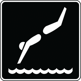 Colour suggestions welcome  -PB
|
|
|
|
|
Someguy
|
|
Group: Forum Members
Posts: 2.8K,
Visits: 0
|
Could go with the slogan: "Dive into Victory!" [size=1]*This is not a claim that Melbourne Victory is a club of divers[/size] Edited by Someguy: 9/5/2014 10:36:40 AM
|
|
|
|
|
SoapShadow
|
|
Group: Forum Members
Posts: 175,
Visits: 0
|
bluebird wrote:Colour suggestions welcome 
|
|
|
|
|
Someguy
|
|
Group: Forum Members
Posts: 2.8K,
Visits: 0
|
bluebird wrote:Colour suggestions welcome Would you suggest having "Melbourne Victory" written above or below? To be fair that would look pretty spiffy in navy and white.
|
|
|
|
|
bluebird
|
|
Group: Forum Members
Posts: 10K,
Visits: 0
|
Colour suggestions welcome
|
|
|
|
|
shallow hal wants a gal
|
|
Group: Forum Members
Posts: 6.5K,
Visits: 0
|
The roar definitely need an a updates emblem. I would love to see us update our emblem.
|
|
|
|
|
Stabilo
|
|
Group: Forum Members
Posts: 1.2K,
Visits: 0
|
 Thats something i whipped together last year or so in about 15 minutes. Probably needs to be more compact. But you get the idea.
|
|
|
|