A-League Club Crest Re-Designs


A-League Club Crest Re-Designs

Author
Message
George_Worst
George_Worst
Semi-Pro
Semi-Pro (1.5K reputation)Semi-Pro (1.5K reputation)Semi-Pro (1.5K reputation)Semi-Pro (1.5K reputation)Semi-Pro (1.5K reputation)Semi-Pro (1.5K reputation)Semi-Pro (1.5K reputation)Semi-Pro (1.5K reputation)Semi-Pro (1.5K reputation)Semi-Pro (1.5K reputation)Semi-Pro (1.5K reputation)

Group: Forum Members
Posts: 1.4K, Visits: 0
This thread is a prime example of one of the very few things that shit me about this forum. Posters go to the effort to start an interesting thread or in this case spend time creating something interesting to share only to be slammed by a handful of knuckle draggers for daring to have different tastes to themselves. Seriously ](*,) ](*,)
Volrath2002
Volrath2002
Rising Star
Rising Star (931 reputation)Rising Star (931 reputation)Rising Star (931 reputation)Rising Star (931 reputation)Rising Star (931 reputation)Rising Star (931 reputation)Rising Star (931 reputation)Rising Star (931 reputation)Rising Star (931 reputation)Rising Star (931 reputation)Rising Star (931 reputation)

Group: Forum Members
Posts: 903, Visits: 0
sobkowski wrote:
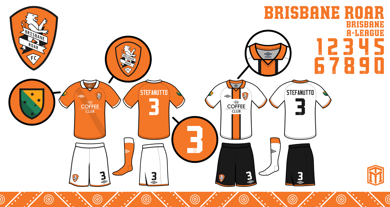
Made this in 2012. Always thought it would be cool if Brisbane did something similar to Roma where they have an away logo.


Imagine whatever colours you'd like in this concept.

Yeah edit the colours and it would look like a good crest for a jersey like the Roma one. It would need tweeking for the full crest but that can easily be done. Good work.

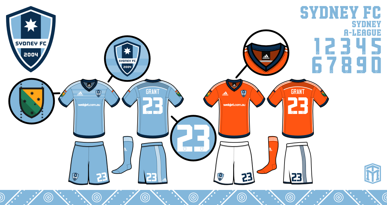
Sydney FC is an interesting one. Never thought they would need to change theirs but really the text outside of the shield is annoying. it can be improved on. I saw a few Sydney FC fans would like an nautical theme to their crest.

Canberra United - Member
KSV Hessen Kassel - Supporter
Lewes FC - Owner

Erebus
Erebus
Legend
Legend (12K reputation)Legend (12K reputation)Legend (12K reputation)Legend (12K reputation)Legend (12K reputation)Legend (12K reputation)Legend (12K reputation)Legend (12K reputation)Legend (12K reputation)Legend (12K reputation)Legend (12K reputation)

Group: Forum Members
Posts: 12K, Visits: 0
I see no real improvements in the 5 logos he did. Most of them are meh. CCM one looks like some dodgy seafood restaurant in Batemans Bay.
The Perth one looks terrible, the MV and Adelaide he shouldn't have even bothered,and there is no improvement at all on the Jets one.

Brisbane is probably the only team in the HAL that really needs a new logo. The others are passable.
Brisbane Ro
Brisbane Ro
Pro
Pro (3.3K reputation)Pro (3.3K reputation)Pro (3.3K reputation)Pro (3.3K reputation)Pro (3.3K reputation)Pro (3.3K reputation)Pro (3.3K reputation)Pro (3.3K reputation)Pro (3.3K reputation)Pro (3.3K reputation)Pro (3.3K reputation)

Group: Forum Members
Posts: 3.3K, Visits: 0
Dan_The_Red wrote:
Brisbane Ro wrote:
TheSelectFew wrote:
Brisbane Ro wrote:
Dan_The_Red wrote:
That said, something needs to be done with the horrific current Brisbane logo.


We seem to have done alright with it ;)


It's funny because only you seem to think so.


3 Championships and 2 Premierships.

I'd hazard a guess its not just me who thinks so :lol:


Not questioning the success of the club at all, just a shame they've done it with such a shit logo.


Never thought you were.

And btw, I think you've made it pretty clear what you think of the logo - no need to labour it.
Dan_The_Red
Dan_The_Red
World Class
World Class (6.5K reputation)World Class (6.5K reputation)World Class (6.5K reputation)World Class (6.5K reputation)World Class (6.5K reputation)World Class (6.5K reputation)World Class (6.5K reputation)World Class (6.5K reputation)World Class (6.5K reputation)World Class (6.5K reputation)World Class (6.5K reputation)

Group: Forum Members
Posts: 6.3K, Visits: 0
Brisbane Ro wrote:
TheSelectFew wrote:
Brisbane Ro wrote:
Dan_The_Red wrote:
That said, something needs to be done with the horrific current Brisbane logo.


We seem to have done alright with it ;)


It's funny because only you seem to think so.


3 Championships and 2 Premierships.

I'd hazard a guess its not just me who thinks so :lol:


Not questioning the success of the club at all, just a shame they've done it with such a shit logo.
vanbasten88
vanbasten88
Pro
Pro (3K reputation)Pro (3K reputation)Pro (3K reputation)Pro (3K reputation)Pro (3K reputation)Pro (3K reputation)Pro (3K reputation)Pro (3K reputation)Pro (3K reputation)Pro (3K reputation)Pro (3K reputation)

Group: Forum Members
Posts: 2.9K, Visits: 0
macktheknife wrote:
Adelaide need a new crest entirely.

Couldn't disagree more.
Roar are the club most desperately in need of a re-fresh IMO.

Brisbane Ro
Brisbane Ro
Pro
Pro (3.3K reputation)Pro (3.3K reputation)Pro (3.3K reputation)Pro (3.3K reputation)Pro (3.3K reputation)Pro (3.3K reputation)Pro (3.3K reputation)Pro (3.3K reputation)Pro (3.3K reputation)Pro (3.3K reputation)Pro (3.3K reputation)

Group: Forum Members
Posts: 3.3K, Visits: 0
sobkowski wrote:
Brisbane Ro wrote:
What's the obsession with making colours darker?

This is Australia. It's bright and sunny here. I don't think darker automatically = better.


Don't criticise his design choice of using those colours. I'd like to see you do better, reject.


Please state the part of my post where I criticized the design choice.
johnszasz
johnszasz
Legend
Legend (29K reputation)Legend (29K reputation)Legend (29K reputation)Legend (29K reputation)Legend (29K reputation)Legend (29K reputation)Legend (29K reputation)Legend (29K reputation)Legend (29K reputation)Legend (29K reputation)Legend (29K reputation)

Group: Forum Members
Posts: 28K, Visits: 0
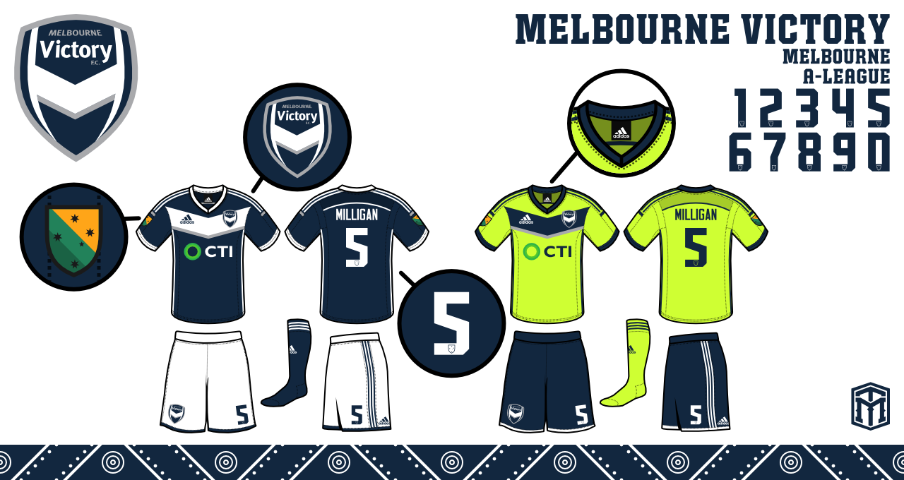
Victory- It's ok a bit darker but I think this is an crest that should never be touched. It's a very good one.

Mariners- Nice, I don't like the waves. It reminds me off the Newcastle Breakers. Pretty sure the Mariners also used a darker yellow/gold one year so the darker shade is fitting.

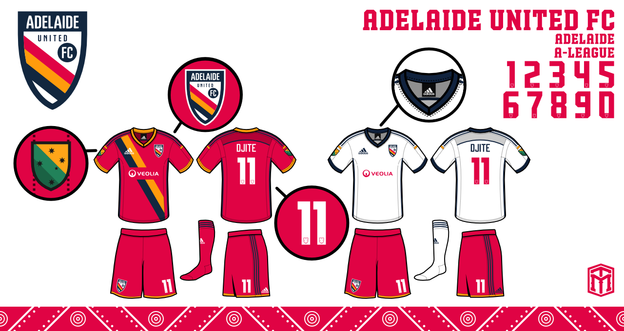
Adelaide- I wouldn't say it's bad but surely there could be some other interesting ideas out there? I'm not a fan of something going outside the crest. In this case, the three lines.

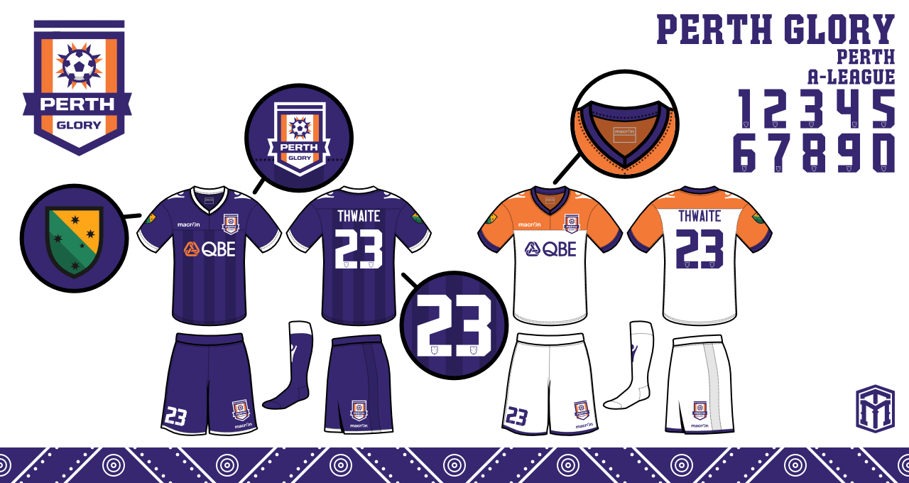
Perth- Nice idea but the 'soccer' ball is always something I don't like to see on football crest and that's why the Mariners one looks so much better. The football looks like a weapon with all those spikes. Change the ball to a black swan and then it'd look much better I think. Ok, it'll look a bit like Swansea but why not?

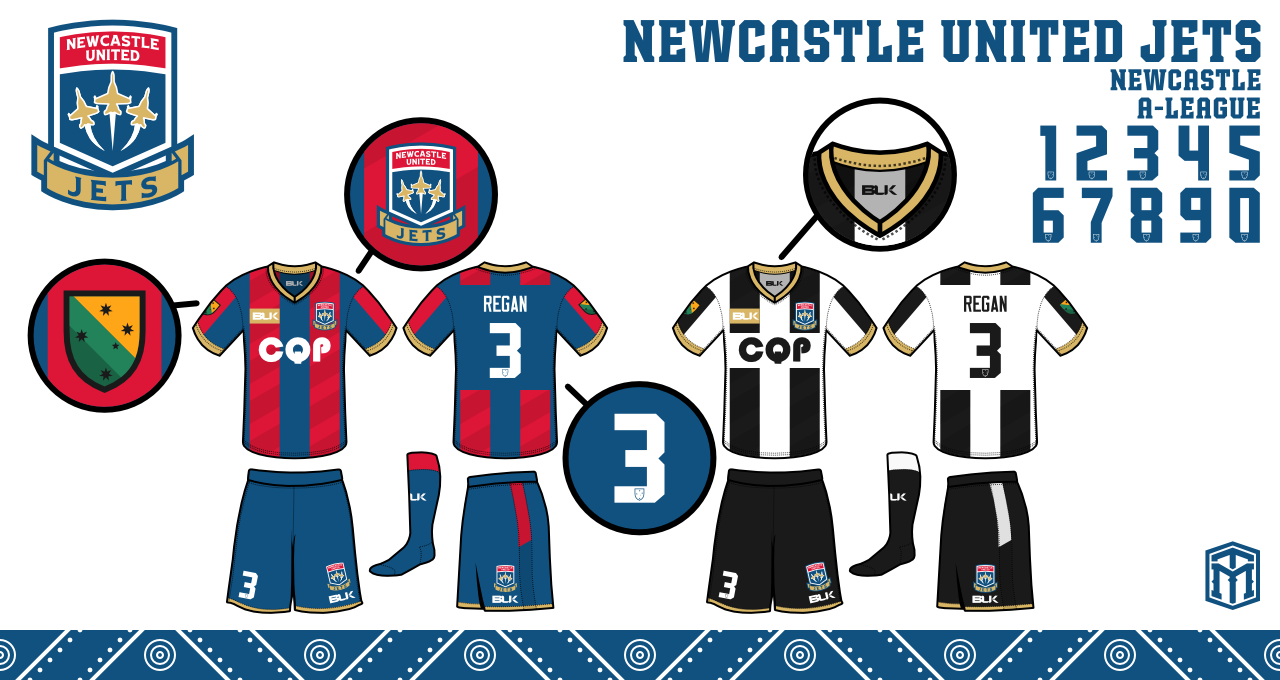
Newcastle- I really like the non curved crest. Well done.

I think Sydney could see some interesting designs.


shallow hal wants a gal
World Class
World Class (6.6K reputation)World Class (6.6K reputation)World Class (6.6K reputation)World Class (6.6K reputation)World Class (6.6K reputation)World Class (6.6K reputation)World Class (6.6K reputation)World Class (6.6K reputation)World Class (6.6K reputation)World Class (6.6K reputation)World Class (6.6K reputation)

Group: Forum Members
Posts: 6.5K, Visits: 0
Central coast, jets and Melbourne ones are great and would be happy to see the logos change to those ones. I'd love to see us change our crest. Have you done any sydney ones.
Brisbane Ro
Brisbane Ro
Pro
Pro (3.3K reputation)Pro (3.3K reputation)Pro (3.3K reputation)Pro (3.3K reputation)Pro (3.3K reputation)Pro (3.3K reputation)Pro (3.3K reputation)Pro (3.3K reputation)Pro (3.3K reputation)Pro (3.3K reputation)Pro (3.3K reputation)

Group: Forum Members
Posts: 3.3K, Visits: 0
TheSelectFew wrote:
Brisbane Ro wrote:
Dan_The_Red wrote:
That said, something needs to be done with the horrific current Brisbane logo.


We seem to have done alright with it ;)


It's funny because only you seem to think so.


3 Championships and 2 Premierships.

I'd hazard a guess its not just me who thinks so :lol:
TheSelectFew
TheSelectFew
Legend
Legend (30K reputation)Legend (30K reputation)Legend (30K reputation)Legend (30K reputation)Legend (30K reputation)Legend (30K reputation)Legend (30K reputation)Legend (30K reputation)Legend (30K reputation)Legend (30K reputation)Legend (30K reputation)

Group: Forum Members
Posts: 30K, Visits: 0
Brisbane Ro wrote:
Dan_The_Red wrote:
That said, something needs to be done with the horrific current Brisbane logo.


We seem to have done alright with it ;)


It's funny because only you seem to think so.


Glory Recruit
Glory Recruit
Legend
Legend (14K reputation)Legend (14K reputation)Legend (14K reputation)Legend (14K reputation)Legend (14K reputation)Legend (14K reputation)Legend (14K reputation)Legend (14K reputation)Legend (14K reputation)Legend (14K reputation)Legend (14K reputation)

Group: Forum Members
Posts: 13K, Visits: 0
I like the CC one.

Good job.

Edited by iridium1010: 27/7/2014 05:07:56 PM
macktheknife
macktheknife
Legend
Legend (16K reputation)Legend (16K reputation)Legend (16K reputation)Legend (16K reputation)Legend (16K reputation)Legend (16K reputation)Legend (16K reputation)Legend (16K reputation)Legend (16K reputation)Legend (16K reputation)Legend (16K reputation)

Group: Forum Members
Posts: 16K, Visits: 0
Adelaide need a new crest entirely.
AndyToddsElbow
AndyToddsElbow
Pro
Pro (2.5K reputation)Pro (2.5K reputation)Pro (2.5K reputation)Pro (2.5K reputation)Pro (2.5K reputation)Pro (2.5K reputation)Pro (2.5K reputation)Pro (2.5K reputation)Pro (2.5K reputation)Pro (2.5K reputation)Pro (2.5K reputation)

Group: Forum Members
Posts: 2.5K, Visits: 0
The Perth one makes absolutely no sense.
SocaWho
SocaWho
World Class
World Class (9.7K reputation)World Class (9.7K reputation)World Class (9.7K reputation)World Class (9.7K reputation)World Class (9.7K reputation)World Class (9.7K reputation)World Class (9.7K reputation)World Class (9.7K reputation)World Class (9.7K reputation)World Class (9.7K reputation)World Class (9.7K reputation)

Group: Forum Members
Posts: 9.3K, Visits: 0
I like the Mariners one. The other ones are just basically the same with a darker tone.
Brisbane Ro
Brisbane Ro
Pro
Pro (3.3K reputation)Pro (3.3K reputation)Pro (3.3K reputation)Pro (3.3K reputation)Pro (3.3K reputation)Pro (3.3K reputation)Pro (3.3K reputation)Pro (3.3K reputation)Pro (3.3K reputation)Pro (3.3K reputation)Pro (3.3K reputation)

Group: Forum Members
Posts: 3.3K, Visits: 0
Dan_The_Red wrote:
That said, something needs to be done with the horrific current Brisbane logo.


We seem to have done alright with it ;)
Dan_The_Red
Dan_The_Red
World Class
World Class (6.5K reputation)World Class (6.5K reputation)World Class (6.5K reputation)World Class (6.5K reputation)World Class (6.5K reputation)World Class (6.5K reputation)World Class (6.5K reputation)World Class (6.5K reputation)World Class (6.5K reputation)World Class (6.5K reputation)World Class (6.5K reputation)

Group: Forum Members
Posts: 6.3K, Visits: 0
Hate the AU redesign. Our current badge is perfect to me. Nothing is more plastic than changing club crests after 10 years of existence.

That said, something needs to be done with the horrific current Brisbane logo.
Brisbane Ro
Brisbane Ro
Pro
Pro (3.3K reputation)Pro (3.3K reputation)Pro (3.3K reputation)Pro (3.3K reputation)Pro (3.3K reputation)Pro (3.3K reputation)Pro (3.3K reputation)Pro (3.3K reputation)Pro (3.3K reputation)Pro (3.3K reputation)Pro (3.3K reputation)

Group: Forum Members
Posts: 3.3K, Visits: 0
What's the obsession with making colours darker?

This is Australia. It's bright and sunny here. I don't think darker automatically = better.
George_Worst
George_Worst
Semi-Pro
Semi-Pro (1.5K reputation)Semi-Pro (1.5K reputation)Semi-Pro (1.5K reputation)Semi-Pro (1.5K reputation)Semi-Pro (1.5K reputation)Semi-Pro (1.5K reputation)Semi-Pro (1.5K reputation)Semi-Pro (1.5K reputation)Semi-Pro (1.5K reputation)Semi-Pro (1.5K reputation)Semi-Pro (1.5K reputation)

Group: Forum Members
Posts: 1.4K, Visits: 0
Awesome job. I love the Jets and Mariners logos in particular. Never really liked the Victory 'Arsenal Rip Off' crest, not sure how we could fix it but to me it looks like it has been thrown together in 5 mins.
Volrath2002
Volrath2002
Rising Star
Rising Star (931 reputation)Rising Star (931 reputation)Rising Star (931 reputation)Rising Star (931 reputation)Rising Star (931 reputation)Rising Star (931 reputation)Rising Star (931 reputation)Rising Star (931 reputation)Rising Star (931 reputation)Rising Star (931 reputation)Rising Star (931 reputation)

Group: Forum Members
Posts: 903, Visits: 0
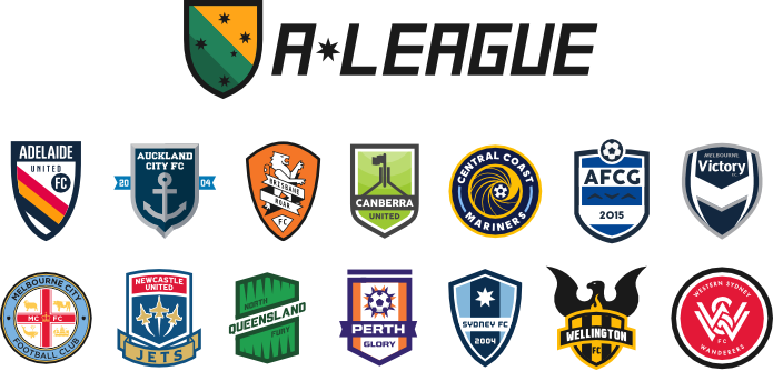
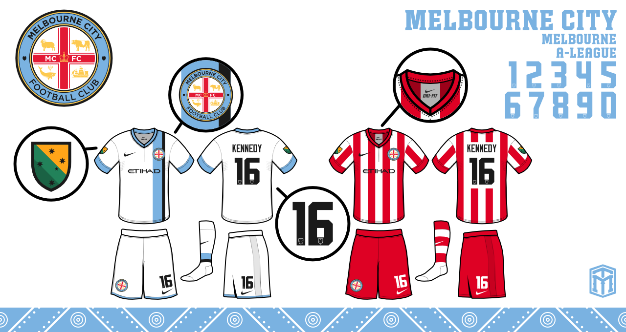
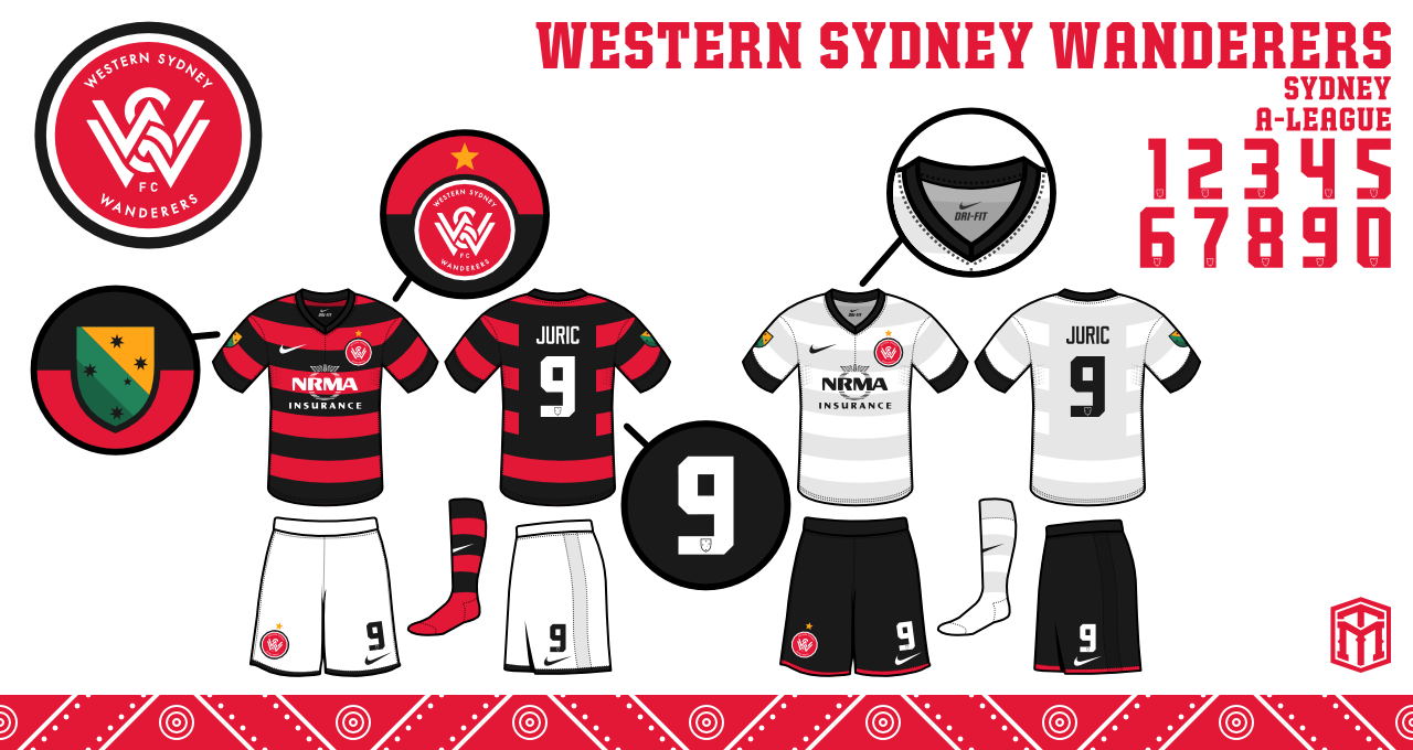
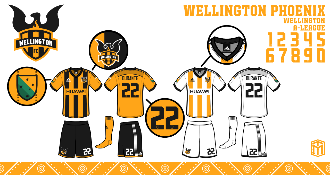
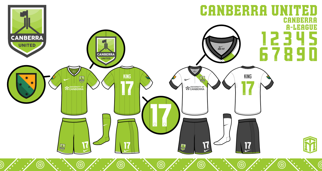
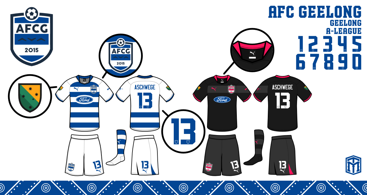
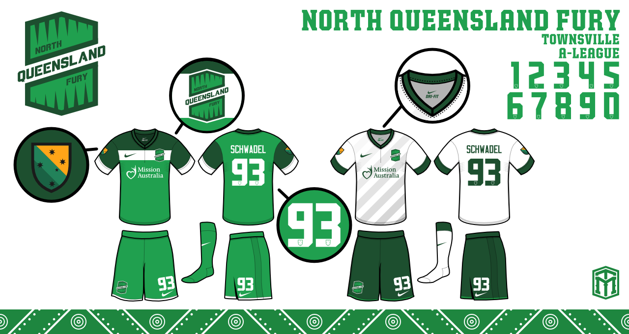
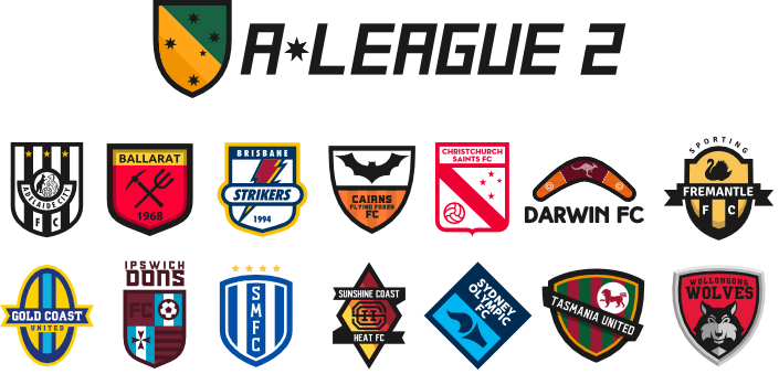
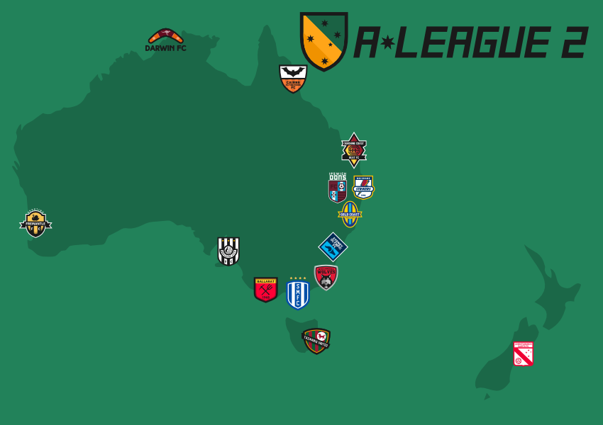
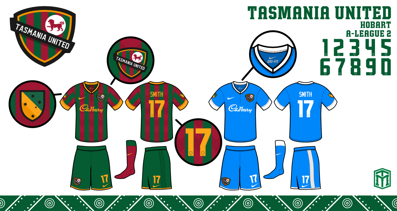
Michael Taylor Design launched a new project this year ( 2015 ) to re-design the A-League and then create a new tiered football system with a second division, the plan for a third division lost pace. In addition, he has added expansion teams to the A-league as requested by "Expand the A-League" Facebook page.

This is the completed project:
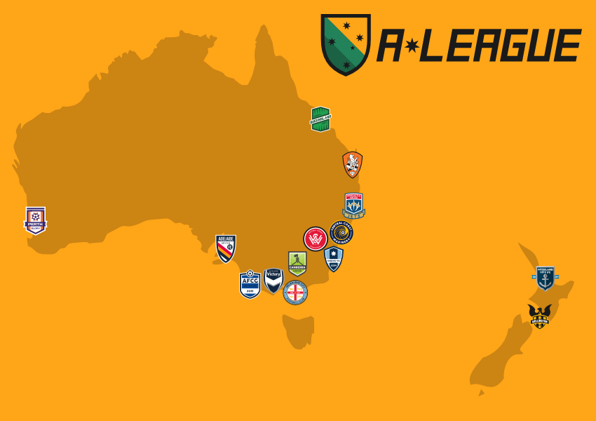


Existing teams:

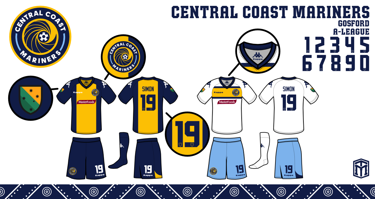
Central Coast Mariners

Melbourne Victory


Newcastle United Jets


Brisbane Roar


Adelaide United


Melbourne City


Perth Glory


Western Sydney Wanderers


Wellington Phoenix


Sydney FC


New teams:

Canberra United


Auckland City


AFC Geelong


North Queensland Fury


Tasmania United


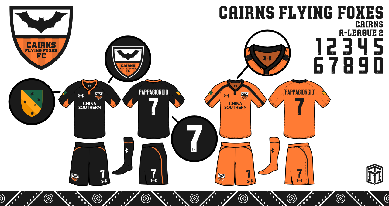
Cairns Flying Foxes ( Was originally going to be Cairns Taipans but changed once designer was aware of the basketball team by the same name )
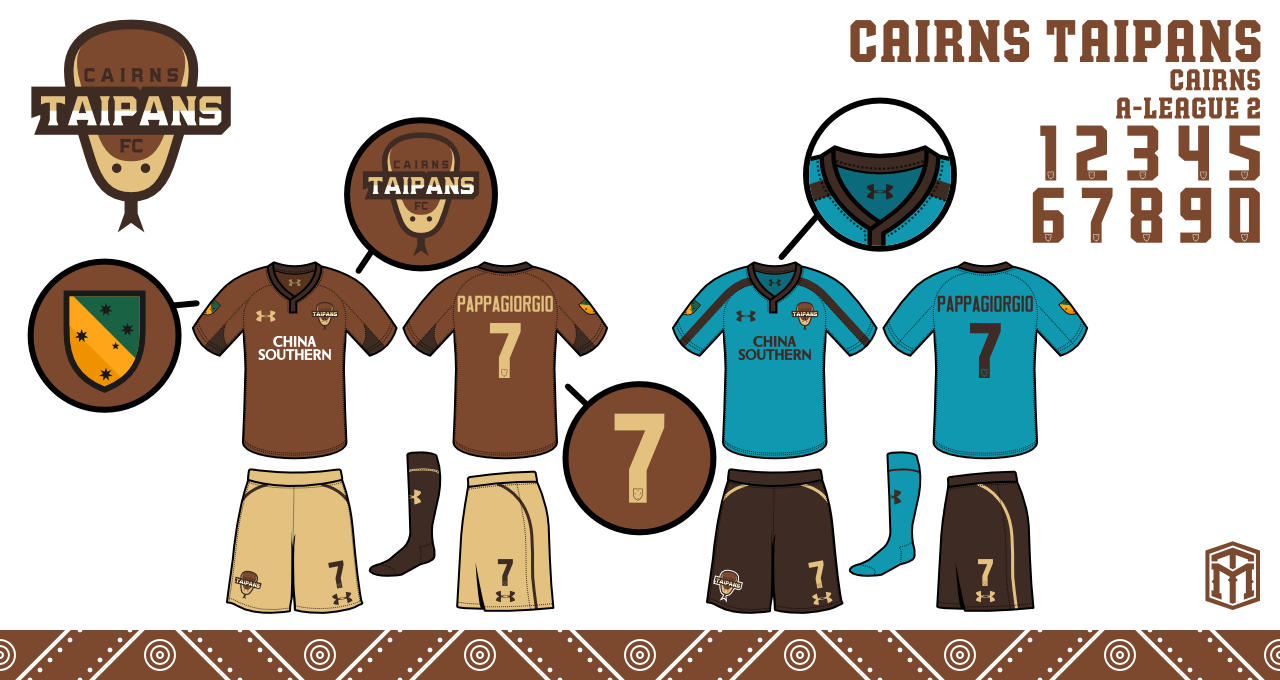

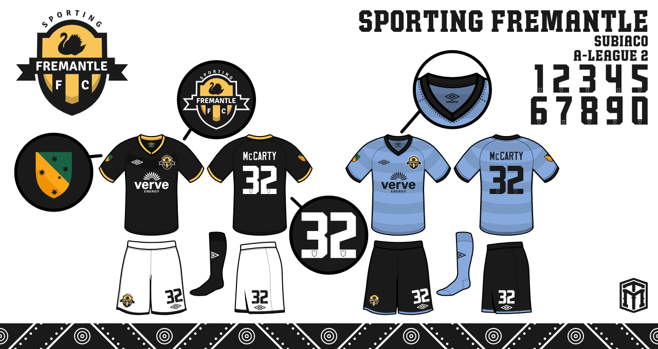
Sporting Fremantle


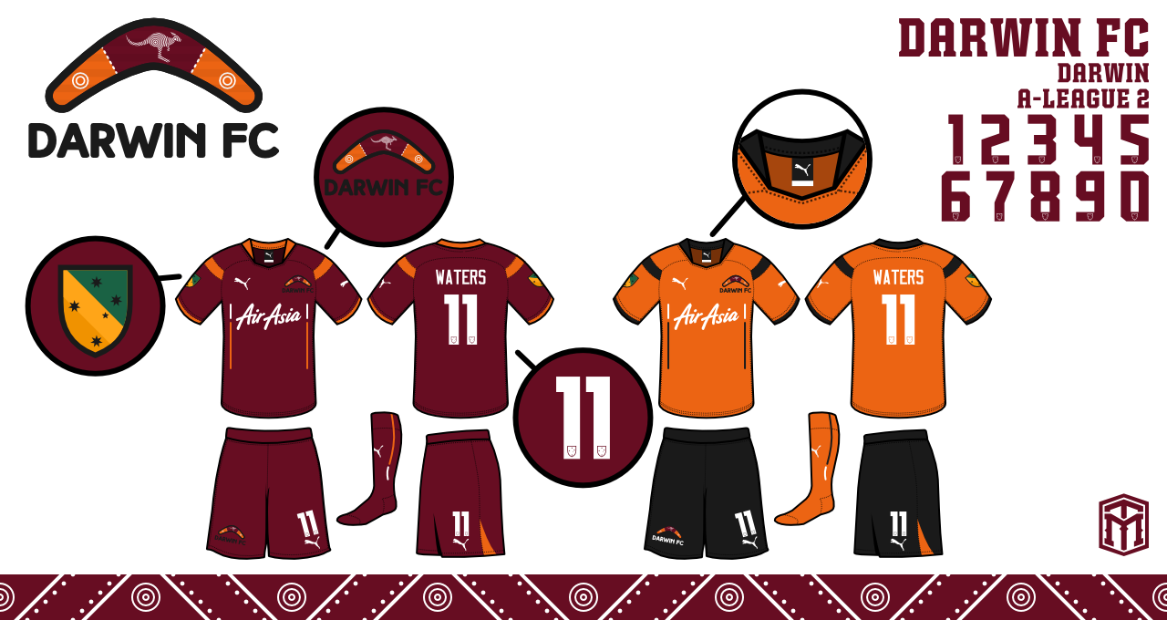
Darwin FC


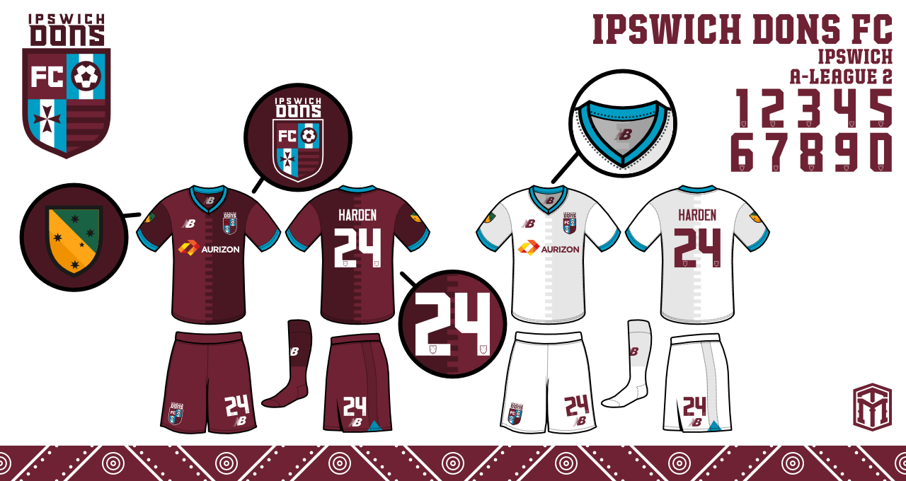
Ipswich Dons


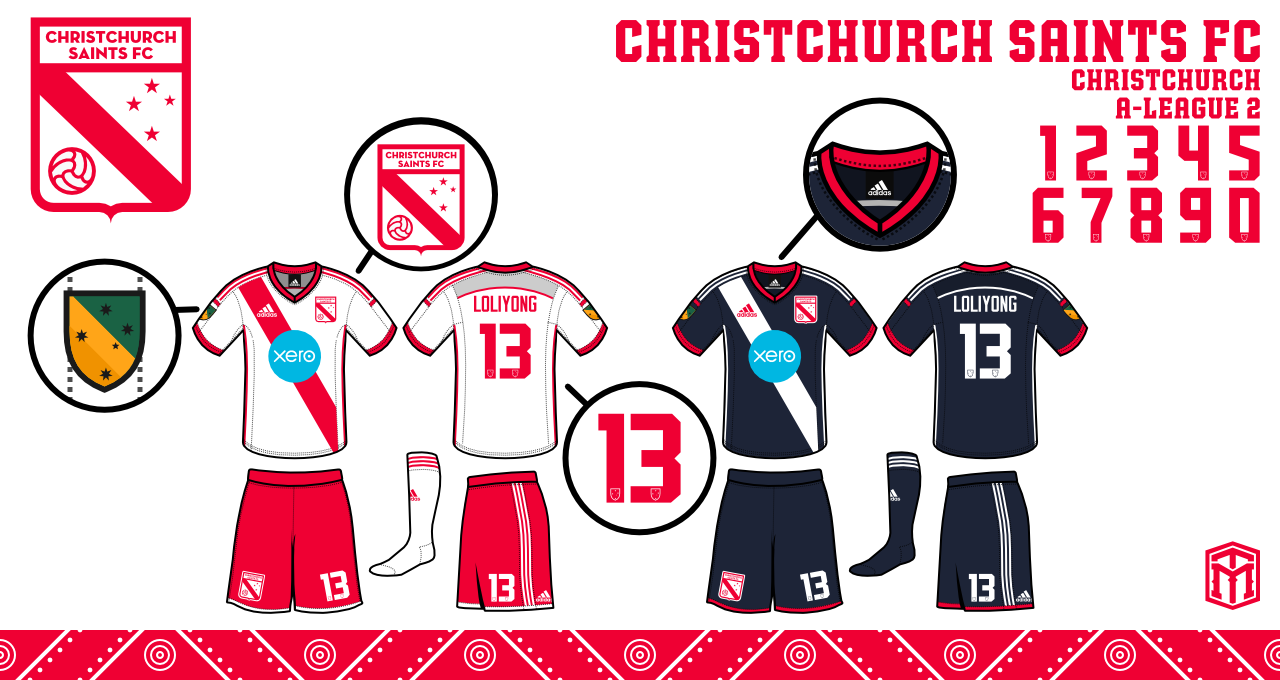
Christchurch Saints


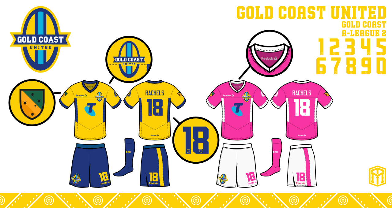
Gold Coast United


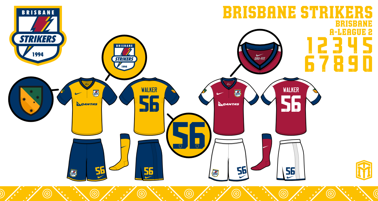
Brisbane Strikers


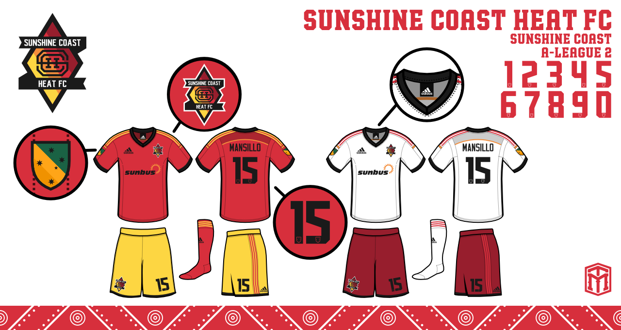
Sunshine Coast Heat FC


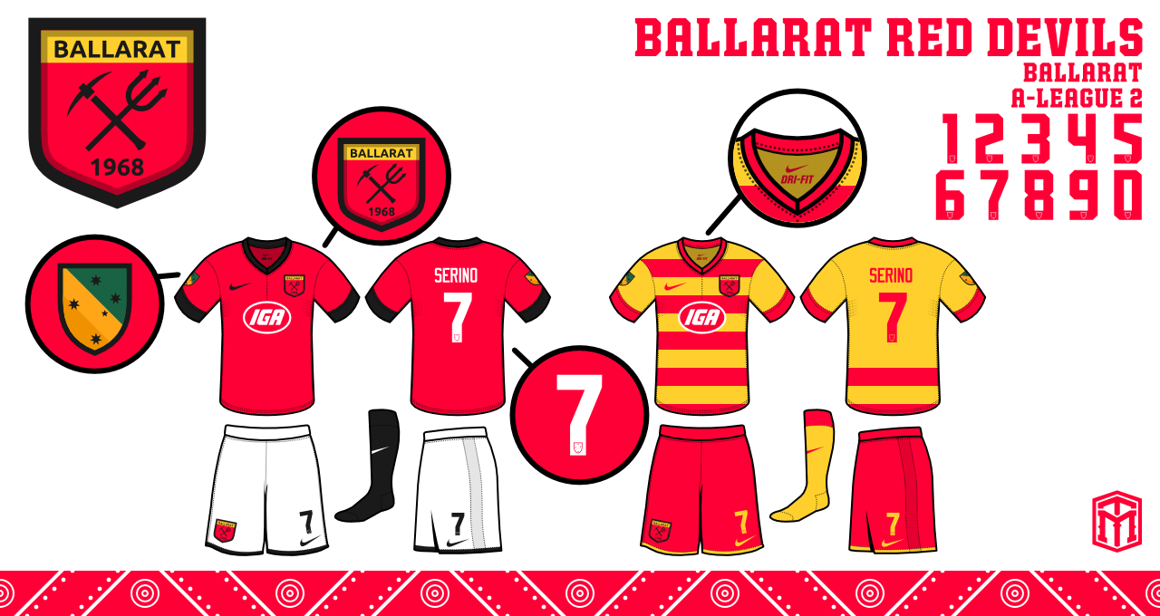
Ballarat Red Devils


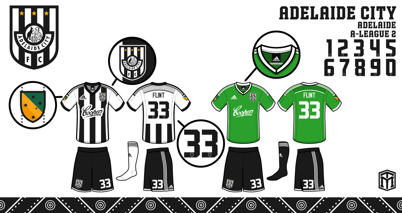
Adelaide City


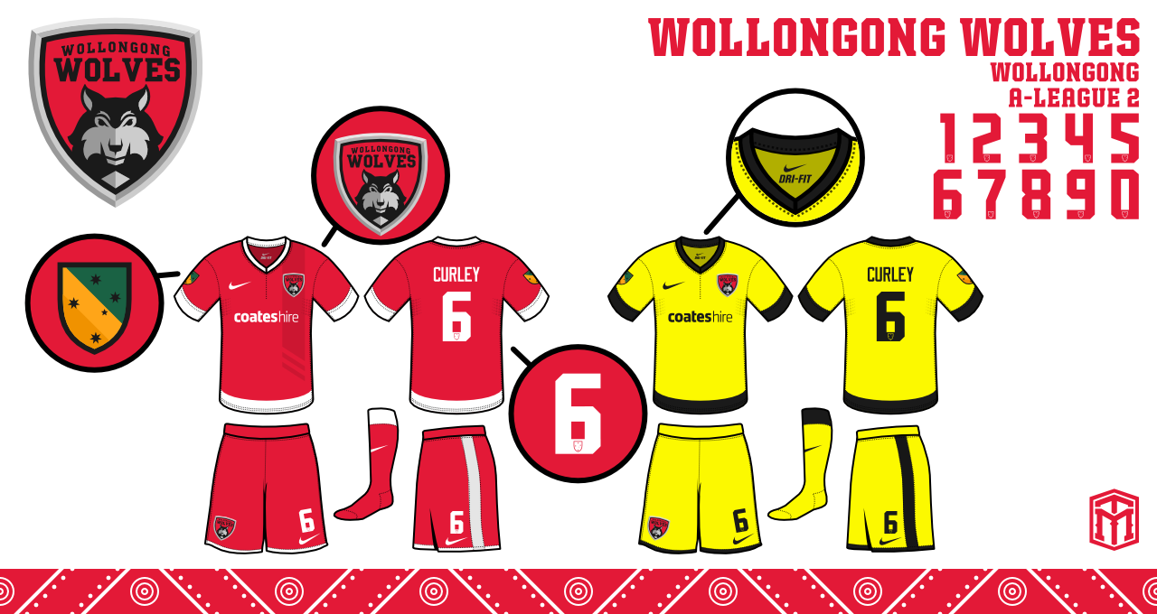
Wollongong Wolves


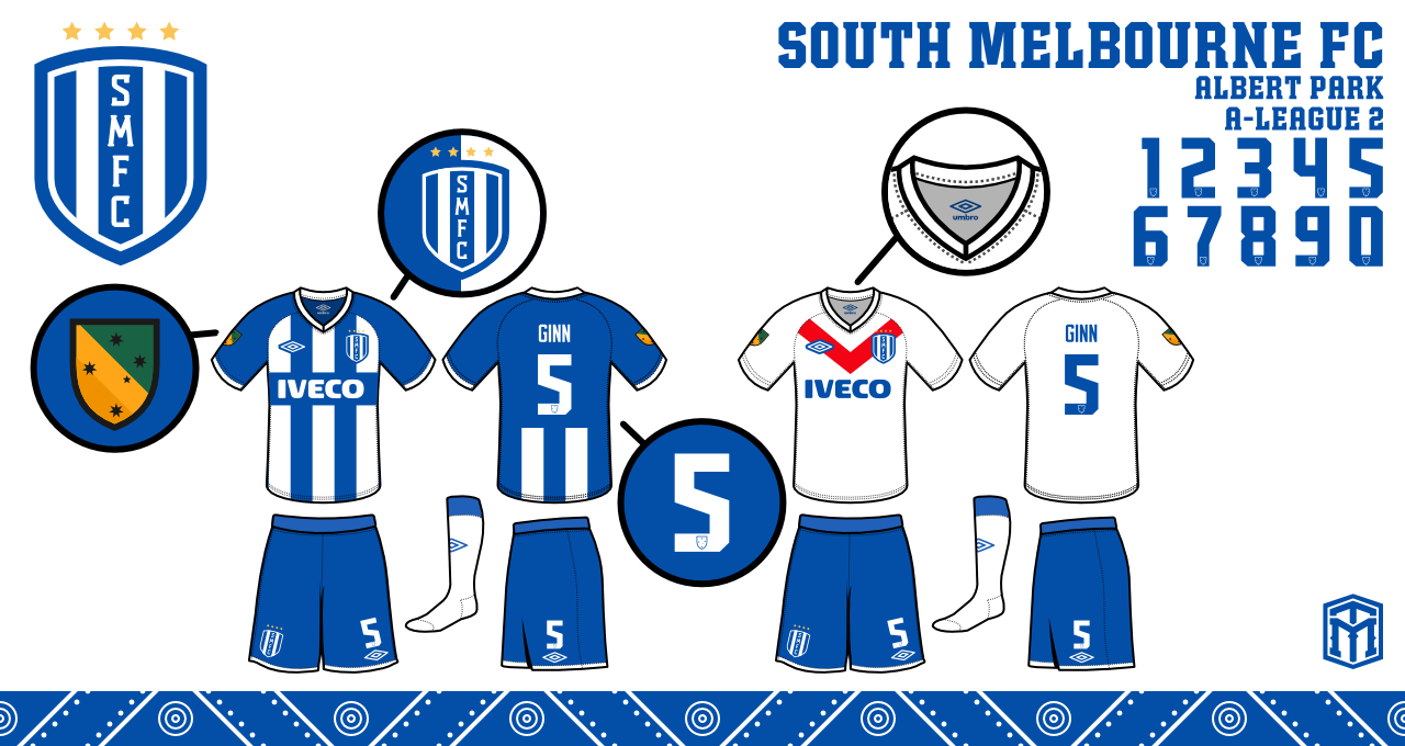
South Melbourne


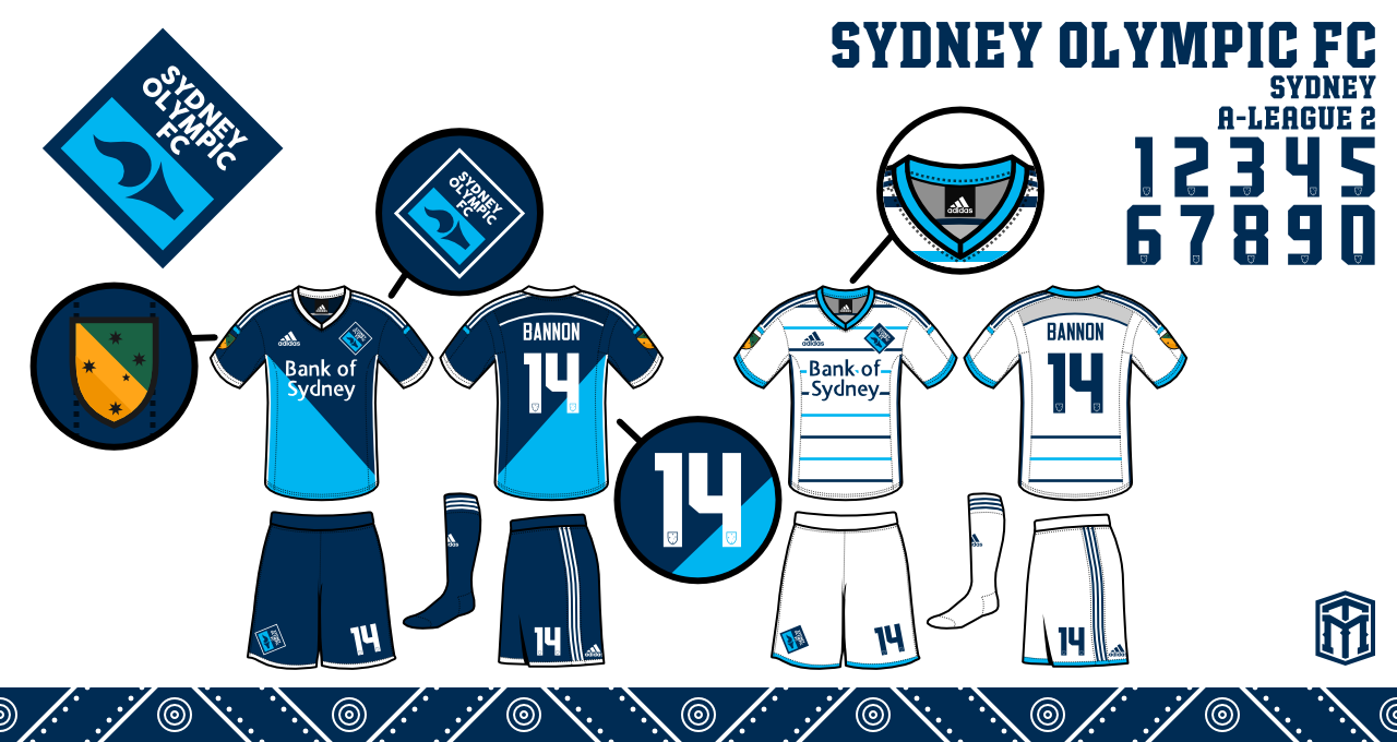
Sydney Olympic FC


Domestic Cups


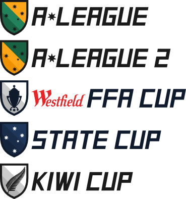
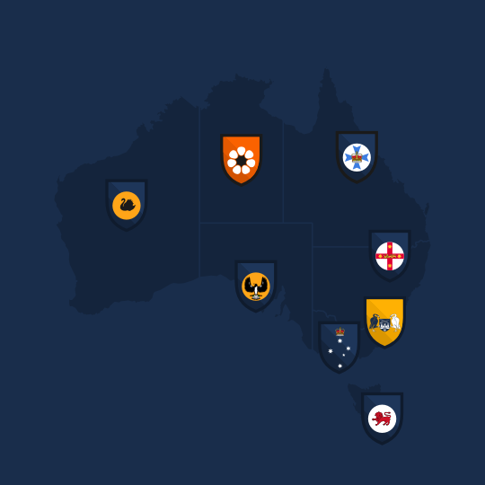
"So this was included in the first post, and some of you really wanted to know about the domestic cups. The top two are the leagues. The Westfield FFA Cup currently exists, and is between all the teams in the A-League and the teams that qualify from the regional leagues. The Kiwi Cup would be a round robin between the 3 New Zealand teams.

But the State Cup is new. I had this idea very early on. The premise would be an 8 team tournament featuring one from each state and territory. The teams would qualify in their own state before the final tournament."


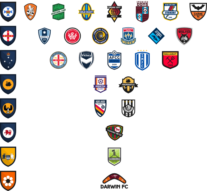
"Here's a breakdown of teams from the two leagues I made. Clearly the top 3 have a tougher time, but it would even out with expanded qualification from lower leagues. Just something I had an idea for, and thought I should share for the finale."


ORIGINAL POST

So following on from the continued interest in the Brisbane Roar crest I thought it might be a nice idea to open a thread that covers more generally the A-League as a whole. So please post any opinions, banter and design ideas for any of the A-league clubs.

One set of redesigns that cought my eye was by Michael Taylor Design ( http://sportslogospot.blogspot.com.au/2013_04_01_archive.html ) before the start of last season ( 2013 ).

He only completed 5 teams and I have asked him if any more are on the way but alas the project is on the backburner.

My personal favs out of what he did would be Central Coast Mariners and Perth Glory.

But the Adelaide United crest I think has too much white, I think the 'United' needs to be larger and put the FC down into the white space. I think it would use the space better and poroduce a better crest overal.

Have a look and tell me what you guys think.

Perth Glory:

"The second team in my series is Perth. Their logo is pretty gradient-astic. There isn’t really imagery for glory, so I took the sun burst and ball and just kinda created around it. I did a vertical oval, took some creative liberties, added the name and year, and thought the final product was pretty good."

Melbourne Victory:
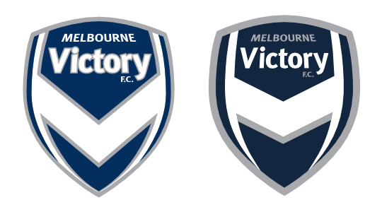
"I feel like the Victory are a few minor tweaks away from a great crest. I cut down on the amount of grey used around the V shape. I took the outlines around the Victory, really just tried to make the whole look fresher."

Central Coast Mariners:
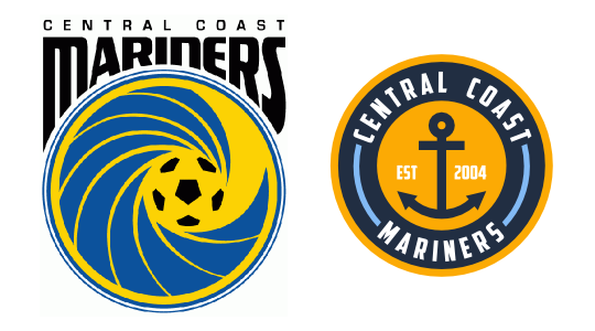
"My 3rd A-League rebrand, this time the newly crowned champions. I wanted to put the logo entirely into a circle, so I ended up with a yellow and navy circle. I used powder blue as another color in addition to the main two. Instead of the wave, I put an anchor."

Newcastle United Jets:
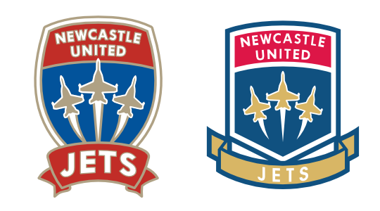
"The crest was a difficult upgrade, because the colors don't work together on how I normally go about logos, with the darker colors always making outlines. I did what I could, and just tried to clean up the look.I adjusted all the colors a little to try and make them pop."

Adelaide United:
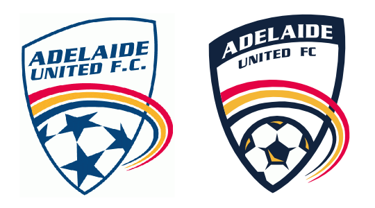
"So this was the first team I did in this series. The logo had a lot of potential, but it needed to not look thrown together. I made the blue bolder, thickened the outlines, and arched the words to make it look like it isn’t slapped on there."


Edited by Volrath2002: 27/7/2014 05:43:50 PM

Edited by volrath2002: 9/7/2015 01:59:42 PM

Canberra United - Member
KSV Hessen Kassel - Supporter
Lewes FC - Owner

GO


Select a Forum....


Inside Sport


Search