|
Volrath2002
|
|
Group: Forum Members
Posts: 903,
Visits: 0
|
The completed set of Michael Taylor Design's redesign of the A-League is now up in full on the first post of the thread. Check it out
Canberra United - Member
KSV Hessen Kassel - Supporter
Lewes FC - Owner
|
|
|
|
|
|
|
Volrath2002
|
|
Group: Forum Members
Posts: 903,
Visits: 0
|
The First Division is now completed with AFC Geelong and North Queensland Fury added. Second dvision to come next.
Canberra United - Member
KSV Hessen Kassel - Supporter
Lewes FC - Owner
|
|
|
|
|
highkick05
|
|
Group: Forum Members
Posts: 14K,
Visits: 0
|
Not a fan of this http://sportslogospot.blogspot.com.au/2015/03/a-league-auckland-city.htmlKeep the kit th@ dark blue I like it. keep the whole kit that colour pants and shorts. chuck a small nike logo on it and give them an alternate colour instead of white for their away kit. Like yellow. something bright that kicks the league in the ass when they are playing away. Not a fan of these SHoulder pad lines, and stripes throughout the kits. I don't even like the V on the Victory Jersey and that should be burnt into people's minds by now, just never sat right for me. Actually if Victory wanted to remove it I think they could get away with the V in the logo sticking out in small logo on the left side of the shirt. Maybe as if like, it looks as if its protruding out of the logo, like. But who knows where you'd go from thei r with the rest of it. Obviously you wouldn't want every teams kit looking all the same. WSW is a great striped kit. Dunno what \variants they have in EPL etc although i've probably seen most. ...anyway Edited by highkick05: 28/3/2015 09:02:05 PM
|
|
|
|
|
highkick05
|
|
Group: Forum Members
Posts: 14K,
Visits: 0
|
Volrath2002 wrote:highkick05 wrote:Its clear that most of even the A-League kits have too much detail incorporated into the designs. But maybe that's the only way they can get sponsors on board.
Majority of the striping is stupid, diagonal stripes across the front, large weird looking shapes.. fucking awful..
What's the link Volrath2002 ? I get your point. There are some strange looking jerseys in the A-League this season, Wellington's away jersey springs to mind, but there are also very simple jerseys thrown into the mix too, look at CCM or Brisbane Roar. I would argue even the Sydney FC home jersey is a plain pin stripe jersey, just has a woppa of an ugly sponsor on the front ( sorry webjet but bloody hell it is a shoker ). Victory's jerseys have pretty much stayed the same all along the life of the A-League with the 'V' getting ever so shorter but they again have a very akward looking major sponsor on the front of both the home and away jerseys. WSW have a very simple hoops jersey but the NRMA logo stands out more because it is larger than last season's. I think the biggest problem with a lot of the kits comes down to not so much overall design but more how the sponsors logo's do not mesh well with the overal style of te shirt. And to that end Michael Taylor has done quite a nice job on his kits to simplify and/or clean up a lot of the front of shirt major sponsorship. He has also removed some of the clutter from the front too by moving the league crest/logo to the arm sleave. Something I know a lot of people are in favour of. By memory I think it is Australia and Austria who are the two nations who have their football leagues play with the league crest/logo on the front of kits. So I guess what I am trying to say is simply there needs to be a holistic approach to kit design, don't just design a kit and just slap on the sponsorship, crest and league logo. This is the link to the A-League post, just look at the right hand menu to see each of the team posts: http://sportslogospot.blogspot.com.au/2015/03/a-league.html Spot on mate, even the nike logo is way too big. Sponsors logo's probably here to stay but a lot of these A-League Jersey's would look so much better if there was 1 very tiny logo on the shorts and shirt. They are fucking everywhere and too big
|
|
|
|
|
Volrath2002
|
|
Group: Forum Members
Posts: 903,
Visits: 0
|
highkick05 wrote:Its clear that most of even the A-League kits have too much detail incorporated into the designs. But maybe that's the only way they can get sponsors on board.
Majority of the striping is stupid, diagonal stripes across the front, large weird looking shapes.. fucking awful..
What's the link Volrath2002 ? I get your point. There are some strange looking jerseys in the A-League this season, Wellington's away jersey springs to mind, but there are also very simple jerseys thrown into the mix too, look at CCM or Brisbane Roar. I would argue even the Sydney FC home jersey is a plain pin stripe jersey, just has a woppa of an ugly sponsor on the front ( sorry webjet but bloody hell it is a shoker ). Victory's jerseys have pretty much stayed the same all along the life of the A-League with the 'V' getting ever so shorter but they again have a very akward looking major sponsor on the front of both the home and away jerseys. WSW have a very simple hoops jersey but the NRMA logo stands out more because it is larger than last season's. I think the biggest problem with a lot of the kits comes down to not so much overall design but more how the sponsors logo's do not mesh well with the overal style of te shirt. And to that end Michael Taylor has done quite a nice job on his kits to simplify and/or clean up a lot of the front of shirt major sponsorship. He has also removed some of the clutter from the front too by moving the league crest/logo to the arm sleave. Something I know a lot of people are in favour of. By memory I think it is Australia and Austria who are the two nations who have their football leagues play with the league crest/logo on the front of kits. So I guess what I am trying to say is simply there needs to be a holistic approach to kit design, don't just design a kit and just slap on the sponsorship, crest and league logo. This is the link to the A-League post, just look at the right hand menu to see each of the team posts: http://sportslogospot.blogspot.com.au/2015/03/a-league.html
Canberra United - Member
KSV Hessen Kassel - Supporter
Lewes FC - Owner
|
|
|
|
|
highkick05
|
|
Group: Forum Members
Posts: 14K,
Visits: 0
|
Its clear that most of even the A-League kits have too much detail incorporated into the designs. But maybe that's the only way they can get sponsors on board. Majority of the striping is stupid, diagonal stripes across the front, large weird looking shapes.. fucking awful.. What's the link Volrath2002 ?
|
|
|
|
|
Volrath2002
|
|
Group: Forum Members
Posts: 903,
Visits: 0
|
wow such hate :P Chill out man, people just want to express ideas. Anyway, Auckland FC now added.
Canberra United - Member
KSV Hessen Kassel - Supporter
Lewes FC - Owner
|
|
|
|
|
highkick05
|
|
Group: Forum Members
Posts: 14K,
Visits: 0
|
 ahaha, how did get the transperancy squares Adobe Photoshop typically uses for transparency, actually into the club kit design. lol Now we have A-League players running around looking like they've been actually created straight out Photoshop! Amateurs... Edited by highkick05: 21/3/2015 04:40:42 PM
|
|
|
|
|
highkick05
|
|
Group: Forum Members
Posts: 14K,
Visits: 0
|
Most of the A-League logo's suck balls. Why put so much detail into the logo's ? flyingigproductions.com.au is UTTER TRIPE this: WOW , just WOW putting a soccer ball in a logo, amazing  Take a good in depth search of overseas club logos and see that a lot just have 2 things... CLUB or CLUB & FC with tiny insignia or such two or 3 colours and your usual tones for shadows and lines. Use of colours is also a problem especially for the team kits. Light BLUE? Mid Grey? fucking come on... who the fuck uses such bland colours for team colours. You guys have no brains, typical pragmatic black and white idiots at the top of everything in there field in Australia. You guys are fucking idiots Get some proper art people in please, these are all shit. By art people I mean people with the gift for art, not people who haven't got a creative bone in there body sitting behind Adobe Photoshop looking at folder of downloaded copies of every other teams logos from around the world and pumping out this utter shit. So what you jag one good logo out of your ass out of 1000.
|
|
|
|
|
Volrath2002
|
|
Group: Forum Members
Posts: 903,
Visits: 0
|
New designs for Sydney FC and Wellington now up.
Canberra United - Member
KSV Hessen Kassel - Supporter
Lewes FC - Owner
|
|
|
|
|
Volrath2002
|
|
Group: Forum Members
Posts: 903,
Visits: 0
|
Burztur wrote:Love it.
Although SFC and Nix are missing as existing teams... Yeah they are coming. As for Canberra Athletic, I saw that crest, it was nice, I must say I was very impressed with this crest, it is simple yet very to the point uniquely Canberra. It also follows along the same lines as the W-league team. I would however pick a different name to Canberra United if it was me. I like the sounds of something a long the lines of Canberra Highlanders or something. There is already Adelaide United and Newcastle United Jets in the league.
Canberra United - Member
KSV Hessen Kassel - Supporter
Lewes FC - Owner
|
|
|
|
|
toffeeAU
|
|
Group: Forum Members
Posts: 1.4K,
Visits: 0
|
Liking the overall design process. Although to be honest, I always preferred the Canberra Athletic crest that Dale used to use.
|
|
|
|
|
Burztur
|
|
Group: Forum Members
Posts: 9.1K,
Visits: 0
|
Love it.
Although SFC and Nix are missing as existing teams...
|
|
|
|
|
Volrath2002
|
|
Group: Forum Members
Posts: 903,
Visits: 0
|
|
|
|
|
|
paladisious
|
|
Group: Moderators
Posts: 39K,
Visits: 0
|
haha yeah the Seven staff are probably regulars there.
|
|
|
|
|
imonfourfourtwo
|
|
Group: Forum Members
Posts: 2.9K,
Visits: 0
|
paladisious wrote:Is that one of yours, imonfourfourtwo?  Haha, no that's funnily enough from BigFooty. 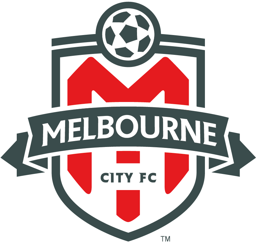
|
|
|
|
|
victorykicksass
|
|
Group: Forum Members
Posts: 644,
Visits: 0
|
TheSelectFew wrote:Sue them!!! "Nobody screws 7 like soccer"
|
|
|
|
|
TheSelectFew
|
|
Group: Forum Members
Posts: 30K,
Visits: 0
|
|
|
|
|
|
paladisious
|
|
Group: Moderators
Posts: 39K,
Visits: 0
|
Is that one of yours, imonfourfourtwo?
|
|
|
|
|
imonfourfourtwo
|
|
Group: Forum Members
Posts: 2.9K,
Visits: 0
|
|
|
|
|
|
paladisious
|
|
Group: Moderators
Posts: 39K,
Visits: 0
|
yoshi2284 wrote:Hopefully Melbourne City's crest changes next year. New York City doesn't have the St George Cross on it.... But the City of Melbourne's flag does.
|
|
|
|
|
Roarz
|
|
Group: Forum Members
Posts: 3.9K,
Visits: 0
|
I think these logos are all class. As you said, with a different font it would be better, but still awesome imo Perfect. =d> Class. Edited by Roarz: 31/10/2014 01:17:40 PMEdited by Roarz: 31/10/2014 01:21:30 PM
|
|
|
|
|
yoshi2284
|
|
Group: Forum Members
Posts: 159,
Visits: 0
|
Hopefully Melbourne City's crest changes next year. New York City doesn't have the St George Cross on it....
|
|
|
|
|
paladisious
|
|
Group: Moderators
Posts: 39K,
Visits: 0
|
BA81 wrote:I made this Victory logo in the style of the VFL-era AFL badges... not to replace the current badge, but for use in (unofficial?) merch/banners etc. - let's face it, it really doesn't get any more 'Melburnian' than this:  Edited by BA81: 15/9/2014 12:55:20 PM Edited by BA81: 15/9/2014 12:55:20 PM I see what you did there!
|
|
|
|
|
zander
|
|
Group: Forum Members
Posts: 81,
Visits: 0
|
Volrath2002 wrote:samb wrote:Volrath2002 wrote:Wow check this out: Personal project by Flying Pig Productions on a brand redesign for the South Coast Wolves ( Wollongong Wolves ). As this is a possible expansion club for the A-League I thought I would add it in here. Check out the project development stages here: http://www.flyingpigproductions.com.au/southcoastwolves/They have various versions of the crest as well as kits for the club. Quite interesting really. Loving this; looks a bit cluttered but other than that Id say it surpasses the quality of most the current A-league crests. They actually did make a simplier version with Wollongong instead of South Coast after some community feedback  "Due to concerns of the crest/logo being too busy, we made some minor changes to try to simplify the crest. We removed the Star of the NSW flag as this could be confused with stars that are used by European teams to signify wins in the Champions League, or wins in the World Cup by National teams. We also removed the 'year', moved the NSW Gov logo to replace the star and repositioned some elements. We also tried out using "Wollongong" instead of "South Coast" as it is more traditional and rolls off the tounge better." "Due to concerns of the crest/logo being too busy, we made some minor changes to try to simplify the crest. We removed the Star of the NSW flag as this could be confused with stars that are used by European teams to signify wins in the Champions League, or wins in the World Cup by National teams. We also removed the 'year', moved the NSW Gov logo to replace the star and repositioned some elements. We also tried out using "Wollongong" instead of "South Coast" as it is more traditional and rolls off the tounge better."I think the name of the club is interesting as traditionally it would be Wollongong, currently it is South Coast but it consists of all the Illawarra so really it could be any of them. From what I understand the reason for the change currently in 2013 was the old Wollongong Wolves ( formally Wollongong City FC ) went bust and the current club in technical terms is a phoenix club, I could be wrong about this but that is what I have been told. As for the concerns about the name of South Coast it is no more confusing than Central Coast, but with the crest design they have tried to incorporate the NSW waratah as a symble to where the club comes from. Looks more like a bear than a wolf.
|
|
|
|
|
eccy
|
|
Group: Forum Members
Posts: 1,
Visits: 0
|
Volrath2002 wrote:So following on from the continued interest in the Brisbane Roar crest I thought it might be a nice idea to open a thread that covers more generally the A-League as a whole. So please post any opinions, banter and design ideas for any of the A-league clubs. One set of redesigns that cought my eye was by Michael Taylor Design ( http://sportslogospot.blogspot.com.au/2013_04_01_archive.html ) before the start of last season ( 2013 ). Central Coast Mariners: 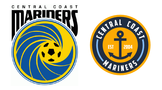 "My 3rd A-League rebrand, this time the newly crowned champions. I wanted to put the logo entirely into a circle, so I ended up with a yellow and navy circle. I used powder blue as another color in addition to the main two. Instead of the wave, I put an anchor." LOL! this central coast mariners re-brand is using THE anchor from the official CITY OF SYDNEY CREST!!!! i agree that it looks nice though, so maybe it wouldn't be too bad for Syndey FC - if it wasn't in a circular New York subway token layout.
|
|
|
|
|
BA81
|
|
Group: Forum Members
Posts: 1.9K,
Visits: 0
|
I made this Victory logo in the style of the VFL-era AFL badges... not to replace the current badge, but for use in (unofficial?) merch/banners etc. - let's face it, it really doesn't get any more 'Melburnian' than this: Edited by BA81: 15/9/2014 12:55:20 PM
|
|
|
|
|
The Maco
|
|
Group: Forum Members
Posts: 5.1K,
Visits: 0
|
sfc0982 wrote:concept for adelaide united, bit unsure of the church in the middle but... ideas?   cheers I like it, clean and simple, looks a lot like Everton's crest
|
|
|
|
|
sfc0982
|
|
Group: Forum Members
Posts: 3,
Visits: 0
|
concept for adelaide united, bit unsure of the church in the middle but... ideas? cheers
|
|
|
|
|
paladisious
|
|
Group: Moderators
Posts: 39K,
Visits: 0
|
Nice, but maybe you should try swapping the white and green, the white background is a bit 70's.
|
|
|
|