|
jdbbshdvjksb
|
|
Group: Forum Members
Posts: 2.4K,
Visits: 0
|
You know you're in the HAL off season when this thread goes to 9 pages
|
|
|
|
|
|
|
BrisbaneBhoy
|
|
Group: Forum Members
Posts: 2.9K,
Visits: 0
|
 I quite like the look of the above logo. As for the logos with the three stars, when did Brisbane win either 30 League titles or 3 ACL titles? I honestly can not remembering either of them happening :?
🇮🇪Hail Hail🇮🇪
|
|
|
|
|
Jon90
|
|
Group: Forum Members
Posts: 934,
Visits: 0
|
BrisbaneBhoy wrote:
As for the logos with the three stars, when did Brisbane win either 30 League titles or 3 ACL titles? I honestly can not remembering either of them happening :?
As for the stars, I agree we should wait for 10's of league titles or an ACL. In general, I hate our logo, the lion is so american-esque, would prefer something a bit more traditional. Edited by Jon90: 22/7/2014 03:58:29 PM
|
|
|
|
|
Heineken
|
|
Group: Forum Members
Posts: 49K,
Visits: 0
|
jdbbshdvjksb wrote:You know you're in the HAL off season when this thread goes to 9 pages Nah, this is just typical FFT.
WOLLONGONG WOLVES FOR A-LEAGUE EXPANSION!

|
|
|
|
|
suspectandy
|
|
Group: Forum Members
Posts: 57,
Visits: 0
|
BA81 wrote:paulbagzFC wrote:If you're gonna have stars though make 'em a bit darker/noticeable.
Although I guess on an orange/black top they'd stick out already.  Shits on the original one. I'd be happy with that, or a complete change.
|
|
|
|
|
Someguy
|
|
Group: Forum Members
Posts: 2.8K,
Visits: 0
|
BrisbaneBhoy wrote:I quite like the look of the above logo. As for the logos with the three stars, when did Brisbane win either 30 League titles or 3 ACL titles? I honestly can not remembering either of them happening :? Traditions are different in different areas for stars. Personally I'd make it 5 major pieces of silverware per star (Championship, Premiership or FFA cup), which would at best give Brisbane one. That said, I'd probably rather there be none, or maybe just one above the current Champions Badge (much like the gold premier league badge for the Champions in England).
|
|
|
|
|
paulbagzFC
|
|
Group: Forum Members
Posts: 44K,
Visits: 0
|
Heineken wrote:jdbbshdvjksb wrote:You know you're in the HAL off season when this thread goes to 9 pages Nah, this is just typical FFT. It'd be typical FFT if this was 9 pages of Brisbane vs Victory wanking. -PB
|
|
|
|
|
BrisbaneBhoy
|
|
Group: Forum Members
Posts: 2.9K,
Visits: 0
|
Someguy wrote:Traditions are different in different areas for stars.
Personally I'd make it 5 major pieces of silverware per star (Championship, Premiership or FFA cup), which would at best give Brisbane one. That said, I'd probably rather there be none, or maybe just one above the current Champions Badge (much like the gold premier league badge for the Champions in England). I personally feel they should only be awarded to clubs who win their respected Confederations International Club competitions. Edited by BrisbaneBhoy: 22/7/2014 05:50:11 PM
🇮🇪Hail Hail🇮🇪
|
|
|
|
|
SlyGoat36
|
|
Group: Forum Members
Posts: 5.9K,
Visits: 0
|
paulbagzFC wrote:Heineken wrote:jdbbshdvjksb wrote:You know you're in the HAL off season when this thread goes to 9 pages Nah, this is just typical FFT. It'd be typical FFT if this was 9 pages of Brisbane vs Victory wanking. -PB Milligan is shit ;)
|
|
|
|
|
Stabilo
|
|
Group: Forum Members
Posts: 1.2K,
Visits: 0
|
|
|
|
|
|
Jon90
|
|
Group: Forum Members
Posts: 934,
Visits: 0
|
I like that actually, of course we're still the roar at the moment.
|
|
|
|
|
paulbagzFC
|
|
Group: Forum Members
Posts: 44K,
Visits: 0
|
SlyGoat36 wrote:paulbagzFC wrote:Heineken wrote:jdbbshdvjksb wrote:You know you're in the HAL off season when this thread goes to 9 pages Nah, this is just typical FFT. It'd be typical FFT if this was 9 pages of Brisbane vs Victory wanking. -PB Milligan is shit ;)  -PB
|
|
|
|
jlm8695
|
|
Group: Banned Members
Posts: 19K,
Visits: 0
|
SlyGoat36 wrote:paulbagzFC wrote:Heineken wrote:jdbbshdvjksb wrote:You know you're in the HAL off season when this thread goes to 9 pages Nah, this is just typical FFT. It'd be typical FFT if this was 9 pages of Brisbane vs Victory wanking. -PB Milligan is shit ;) Fight me 1v1 u fuk
|
|
|
|
|
clockwork orange
|
|
Group: Forum Members
Posts: 8.3K,
Visits: 0
|
ccmpete wrote:For those of you that don't like the maroon and blue.  Thank you thank you thank you. i knew it'd look 100 times better!! I don't even hate the ball anymore. I know I'm asking a lot but can you so it with an orange background instead of white? Edited by clockwork orange: 22/7/2014 09:49:09 PM
|
|
|
|
|
Mfrendin_Roar
|
|
Group: Forum Members
Posts: 1.1K,
Visits: 0
|
Jon90 wrote:BrisbaneBhoy wrote:
As for the logos with the three stars, when did Brisbane win either 30 League titles or 3 ACL titles? I honestly can not remembering either of them happening :?
As for the stars, I agree we should wait for 10's of league titles or an ACL. In general, I hate our logo, the lion is so american-esque, would prefer something a bit more traditional. Edited by Jon90: 22/7/2014 03:58:29 PM but we're not a 'traditional' league? Its like building a victorian house today its just going to look shit compared to a real one. We need to embrace the lion head.
|
|
|
|
|
SlyGoat36
|
|
Group: Forum Members
Posts: 5.9K,
Visits: 0
|
jlm8695 wrote:SlyGoat36 wrote:paulbagzFC wrote:Heineken wrote:jdbbshdvjksb wrote:You know you're in the HAL off season when this thread goes to 9 pages Nah, this is just typical FFT. It'd be typical FFT if this was 9 pages of Brisbane vs Victory wanking. -PB Milligan is shit ;) Fight me 1v1 u fuk Do u even lift fgt?
|
|
|
|
|
ccmpete
|
|
Group: Forum Members
Posts: 1.1K,
Visits: 0
|
clockwork orange wrote:ccmpete wrote:For those of you that don't like the maroon and blue. Thank you thank you thank you. i knew it'd look 100 times better!! I don't even hate the ball anymore. I know I'm asking a lot but can you so it with an orange background instead of white? Edited by clockwork orange: 22/7/2014 09:49:09 PM Not sold on the orange background, but here it is. 
|
|
|
|
|
absent
|
|
Group: Forum Members
Posts: 4.3K,
Visits: 0
|
Mfrendin_Roar wrote:Jon90 wrote:BrisbaneBhoy wrote:
As for the logos with the three stars, when did Brisbane win either 30 League titles or 3 ACL titles? I honestly can not remembering either of them happening :?
As for the stars, I agree we should wait for 10's of league titles or an ACL. In general, I hate our logo, the lion is so american-esque, would prefer something a bit more traditional. Edited by Jon90: 22/7/2014 03:58:29 PM but we're not a 'traditional' league? Its like building a victorian house today its just going to look shit compared to a real one. We need to embrace the lion head. But if there is nothing 'traditional' about the club or league, then why is Brisbane roar in orange and black? Why does their emblem enshrine the lion? If you are going to retain these elements, then retain them!! Properly! But just don't make a needless half-arsed compromise that pleases nobody.
|
|
|
|
|
BrisbaneBhoy
|
|
Group: Forum Members
Posts: 2.9K,
Visits: 0
|
|
|
|
|
WaMackie
|
|
Group: Banned Members
Posts: 3K,
Visits: 0
|
Meh, just leave it as it.
|
|
|
|
|
jdbbshdvjksb
|
|
Group: Forum Members
Posts: 2.4K,
Visits: 0
|
WaMackie wrote:Meh, just leave it as it. Fix the kit first It's a bit like worrying about the dust created by MH17
|
|
|
|
|
Roar #1
|
|
Group: Forum Members
Posts: 6.4K,
Visits: 0
|
What roots? the club isnt Dutch, There is no link between Queensland Lions and Brisbane Roar. Brisbane Roar is 10 years old, not 60 odd like Lions.
|
|
|
|
|
Stabilo
|
|
Group: Forum Members
Posts: 1.2K,
Visits: 0
|
Roar #1 wrote:What roots? the club isnt Dutch, There is no link between Queensland Lions and Brisbane Roar. Brisbane Roar is 10 years old, not 60 odd like Lions. Yep. No link at all. :lol:  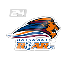 Sure, the Lions don't have current ties with the club, which were formally cut years ago, But to say they have NO link is ridiculous.
|
|
|
|
|
El Toro
|
|
Group: Forum Members
Posts: 861,
Visits: 0
|
Stabilo wrote:Roar #1 wrote:What roots? the club isnt Dutch, There is no link between Queensland Lions and Brisbane Roar. Brisbane Roar is 10 years old, not 60 odd like Lions. Yep. No link at all. :lol: Sure, the Lions don't have current ties with the club, which were formally cut years ago, But to say they have NO link is ridiculous. Agreed. Saying there is no link is like saying that every time a club changes owners they become a completely new team
|
|
|
|
|
Roar #1
|
|
Group: Forum Members
Posts: 6.4K,
Visits: 0
|
El Toro wrote:Stabilo wrote:Roar #1 wrote:What roots? the club isnt Dutch, There is no link between Queensland Lions and Brisbane Roar. Brisbane Roar is 10 years old, not 60 odd like Lions. Yep. No link at all. :lol: Sure, the Lions don't have current ties with the club, which were formally cut years ago, But to say they have NO link is ridiculous. Agreed. Saying there is no link is like saying that every time a club changes owners they become a completely new team But it is a completely different entity to Lions, Lions didn't morph into the Roar because Lions are still operating as a completely different entity and always have. So to say that Brisbane roar are 60 years old and Dutch doesn't make sense. Lions simply signed the original paper work, that doesn't then transfer their history into that of the Roar. The Roar is 10 years old.
|
|
|
|
|
Burztur
|
|
Group: Forum Members
Posts: 9.1K,
Visits: 0
|
They can be different entities yet share the same roots.
That's just like saying a subsidiary company isn't related to its parent which is a bit silly...
Organisations also split off from one another all the time, that doesn't mean they don't have the same roots.
By your analogy, I guess Melbourne Croatia Soccer Club has no relation with the Melbourne Knights.
|
|
|
|
|
paulbagzFC
|
|
Group: Forum Members
Posts: 44K,
Visits: 0
|
The soccer ball is the link! -PB
|
|
|
|
|
Muz
|
|
Group: Forum Members
Posts: 15K,
Visits: 0
|
10 pages!
Member since 2008.
|
|
|
|
|
Roar #1
|
|
Group: Forum Members
Posts: 6.4K,
Visits: 0
|
Burztur wrote:They can be different entities yet share the same roots.
That's just like saying a subsidiary company isn't related to its parent which is a bit silly...
Organisations also split off from one another all the time, that doesn't mean they don't have the same roots.
By your analogy, I guess Melbourne Croatia Soccer Club has no relation with the Melbourne Knights. Who?
|
|
|
|
|
Stabilo
|
|
Group: Forum Members
Posts: 1.2K,
Visits: 0
|
Without the Qld Lions history and work over the previous 50 years, the Roar would never have existed in its current format. Thats how simple it is. Queensland Roar were even based at Richlands in the early years FFS. They are linked. They have ties.
|
|
|
|