|
pv4
|
|
Group: Moderators
Posts: 12K,
Visits: 0
|
+x@ pv4/BRFC92Kingsman is proving something of a quiet risk taker and the way they're pushing the first team kit launch next Wednesday people are expecting something radical with the overall kit (black/Irange stripes on the shirt maybe, orange/White shorts maybe??) but it's the second kit that's got the most discussion because of what they've said it won't be. The third kit remains maroon which has been a real sales success so whoever came up with that one deserves a bonus, fans love especially those thaf follos NRL as well. The only "obvious" thing I can think of is when Roar used to wear blue shorts, so will they go a blue away kit? Or will they just go a random other colour for no reason at all? Being the home is orange, the away almost certainly wouldn't be red, pink, yellow. And with the other options already ruled out, what is left is... green or blue or purple? Keen to see what the outcome is.
|
|
|
|
|
|
|
Waz
|
|
Group: Forum Members
Posts: 19K,
Visits: 0
|
@ pv4
Good point on the blue shorts plus it's the City of Brisbane colour.
|
|
|
|
|
azzaMVFC
|
|
Group: Forum Members
Posts: 6.3K,
Visits: 0
|
 I like the away kit - home kit is rubbish, looks like an advertising board.
|
|
|
|
|
No Totti No Party
|
|
Group: Forum Members
Posts: 490,
Visits: 0
|
+xI like the away kit - home kit is rubbish, looks like an advertising board. Optislim on the front,KFC on the sleeve. love it
|
|
|
|
|
pv4
|
|
Group: Moderators
Posts: 12K,
Visits: 0
|
+xI like the away kit - home kit is rubbish, looks like an advertising board. Any more blue on that away kit and it's basically clashing with the home :lol: Wait is that orange trim on the Away kit?? :lol:
|
|
|
|
|
someguyjc
|
|
Group: Forum Members
Posts: 4K,
Visits: 0
|
+xI like the away kit - home kit is rubbish, looks like an advertising board. Home top definitely looking a bit cluttered, but hey HAL clubs have gotta make money some how and every little bit helps.
|
|
|
|
|
Waz
|
|
Group: Forum Members
Posts: 19K,
Visits: 0
|
I like the away kit better. They've been messing with the V on the home kit for a couple of years and it just gets worse.
Love all the sponsors though - wish Roar had some lol.
|
|
|
|
|
someguyjc
|
|
Group: Forum Members
Posts: 4K,
Visits: 0
|
+x+xI like the away kit - home kit is rubbish, looks like an advertising board. Optislim on the front,KFC on the sleeve. love it It's actually genius when you think about it. People that are gonna buy Optislim products are people that want to lose weight. People that need to lose weight have probably eaten too much KFC. Once they've lost the weight they'll start eating too much KFC again and the circle is complete.
|
|
|
|
|
azzaMVFC
|
|
Group: Forum Members
Posts: 6.3K,
Visits: 0
|
+x+xI like the away kit - home kit is rubbish, looks like an advertising board. Home top definitely looking a bit cluttered, but hey HAL clubs have gotta make money some how and every little bit helps. Pretty sure Optislim and Optivite are the same company...
|
|
|
|
jlm8695
|
|
Group: Banned Members
Posts: 19K,
Visits: 0
|
The away kit is <3 <3
Not a fan of the home kit but $$$$ is $$$$
|
|
|
|
|
WSF
|
|
Group: Forum Members
Posts: 4.6K,
Visits: 0
|
Not sure why anyone wants to be a walking billboard, A-League kits are just too cluttered with advertising for my liking.
|
|
|
|
|
griff1
|
|
Group: Forum Members
Posts: 671,
Visits: 0
|
+x+x+xI like the away kit - home kit is rubbish, looks like an advertising board. Optislim on the front,KFC on the sleeve. love it It's actually genius when you think about it. People that are gonna buy Optislim products are people that want to lose weight. People that need to lose weight have probably eaten too much KFC. Once they've lost the weight they'll start eating too much KFC again and the circle is complete. Haha amazing marketing then hey!
|
|
|
|
|
griff1
|
|
Group: Forum Members
Posts: 671,
Visits: 0
|
+x+x+x+xI like the away kit - home kit is rubbish, looks like an advertising board. Optislim on the front,KFC on the sleeve. love it It's actually genius when you think about it. People that are gonna buy Optislim products are people that want to lose weight. People that need to lose weight have probably eaten too much KFC. Once they've lost the weight they'll start eating too much KFC again and the circle is complete. Haha amazing marketing then hey! Away kit looks really sharp. Fair point about a lot of navy on it, but if paired with white shorts I think it will be fine and wouldn't clash with say Perth
|
|
|
|
|
BRFC_92
|
|
Group: Forum Members
Posts: 2.4K,
Visits: 0
|
+x@ pv4Good point on the blue shorts plus it's the City of Brisbane colour. I reckon blue and yellow. Gotta be.
|
|
|
|
|
marconi101
|
|
Group: Forum Members
Posts: 16K,
Visits: 0
|
Away kit looking like the Brumbies
He was a man of specific quirks. He believed that all meals should be earned through physical effort. He also contended, zealously like a drunk with a political point, that the third dimension would not be possible if it werent for the existence of water.
|
|
|
|
|
Muz
|
|
Group: Forum Members
Posts: 15K,
Visits: 0
|
Home jersey is just awful. Away is better than the home but not by much. When is an A-League team going to have a crack at a full green kit? (Fury excepted.) Waiting to see a nice bottle green job.
Member since 2008.
|
|
|
|
|
TassieMad
|
|
Group: Forum Members
Posts: 110,
Visits: 0
|
|
|
|
|
|
milan_7
|
|
Group: Forum Members
Posts: 6.4K,
Visits: 0
|
+xHome jersey is just awful. Away is better than the home but not by much. When is an A-League team going to have a crack at a full green kit? (Fury excepted.) Waiting to see a nice bottle green job. Yeah unfortunately we don't have a bottle green job in the A-League, but we do have a bunch of bottle jobs! 
|
|
|
|
|
scubaroo
|
|
Group: Forum Members
Posts: 2.8K,
Visits: 0
|
At first i thought the away kit was strange... but I'm really liking it. Love to see it in the flesh, it just looks really balanced.
Home kit should just be the same template just all navy and have a two tone V. Get rid of the optivite.
|
|
|
|
|
aussie scott21
|
|
Group: Forum Members
Posts: 19K,
Visits: 0
|
I would steal the Matildas olympic training kit for victory away. Advertise some crap with it too "supporting our Socceroos" in the lead up to WC season. Keep the A-League logo gold/yellow and original navy emblem. 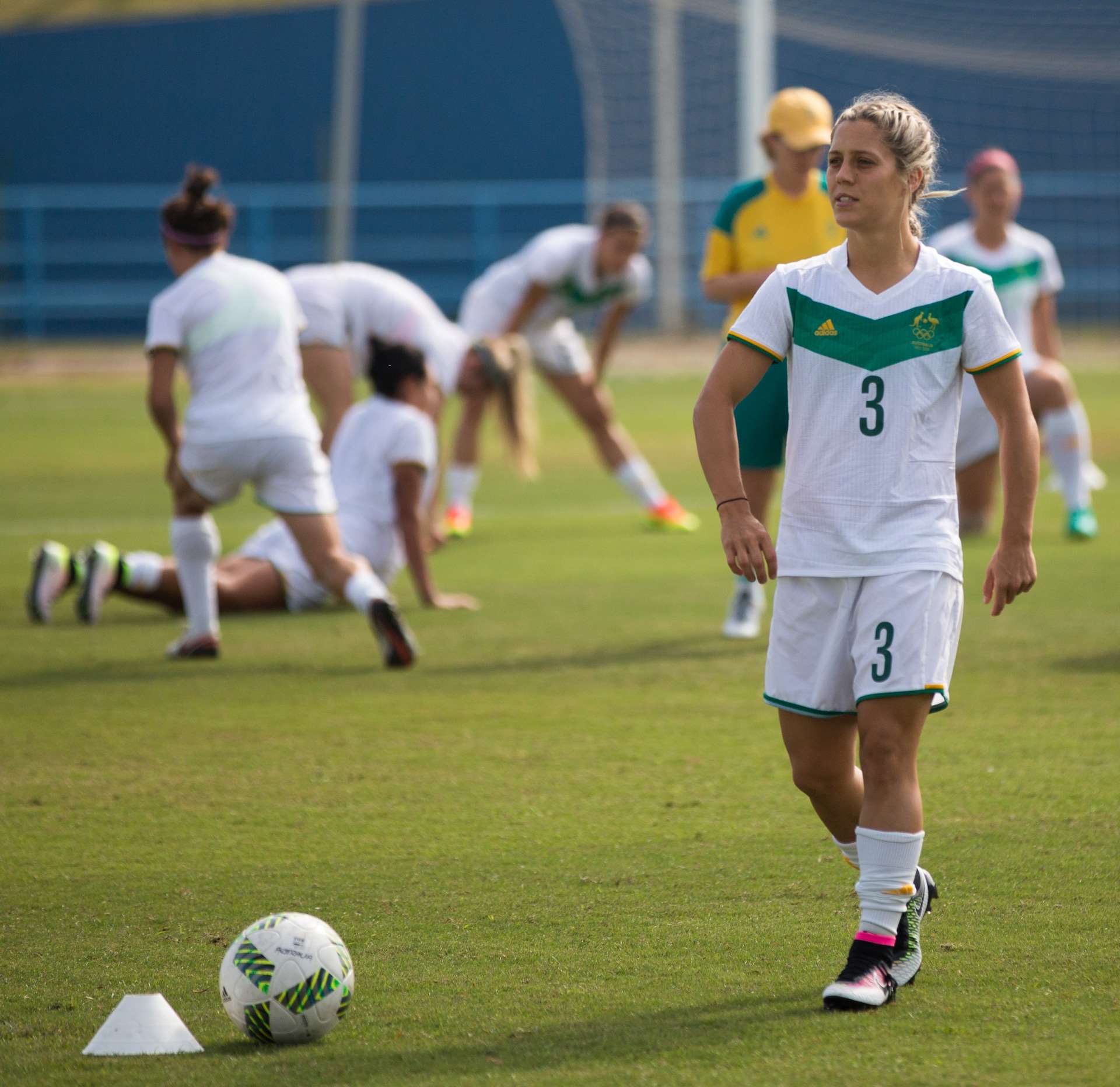 
|
|
|
|
|
paladisious
|
|
Group: Moderators
Posts: 39K,
Visits: 0
|
+xI would steal the Matildas olympic training kit for victory away. Advertise some crap with it too "supporting our Socceroos" . Keep the A-League logo gold/yellow and original navy emblem. Holy shit, that kit.
|
|
|
|
|
Davide82
|
|
Group: Forum Members
Posts: 12K,
Visits: 0
|
+xI like the away kit - home kit is rubbish, looks like an advertising board. Looks like Valeri just jerked off all over Berisha and Bes aint happy about it.
|
|
|
|
|
aussie scott21
|
|
Group: Forum Members
Posts: 19K,
Visits: 0
|
+x+xI like the away kit - home kit is rubbish, looks like an advertising board. Any more blue on that away kit and it's basically clashing with the home :lol: Wait is that orange trim on the Away kit?? :lol: Yeah first thing I saw. Thought they could have gone fluro green or yellow or even use fluro orange.
|
|
|
|
|
WSF
|
|
Group: Forum Members
Posts: 4.6K,
Visits: 0
|
+x+xI like the away kit - home kit is rubbish, looks like an advertising board. Looks like Valeri just jerked off all over Berisha and Bes aint happy about it. :laugh: Can not be unseen now, didn't notice those white dots on the away kill until you said that.
Seems they are little triangles after zooming in, very weird.
|
|
|
|
|
aussie scott21
|
|
Group: Forum Members
Posts: 19K,
Visits: 0
|
Kit Reveal Ahead of State of OriginEach of the football federations has released their kits ahead of the State of Origin competition in 4 weeks time despite the fact they have no players to model on as of yet; the squad selection is not for another week. However, the kits have been released nonetheless.

New South Wales have gone with a simple kit designed by Puma, using the state's traditional colours of sky blue and navy blue for the home kit. Sponsored by beer company VB, their away kit simply retains the navy blue trim but has a primary colour of white.

Victoria's design is one of the most iconic in Australia, with the 'Big V' being in used for nearly 100 years. Comparisons have been obviously made with Melbourne Victory's kit although the away kit uses a classic colour scheme from the 1900s. Manufactured by Nike and sponsored by retail giants Myer, Victoria's kits are the most iconic.

The Maroons have predictably gone with a maroon design for their home kit but have gone with grey trim rather than gold due to the design of the football federation's logo. However, for the away kit, they have gone with a gold kit with maroon trim. The kits have been sponsored by XXXX Gold and manufactured by Nike.

Football West have gone with two different designs, both supplied by Nike and sponsored by insurance company AAMI. At home games, Western Australia will wear a yellow kit with a black diagonal stripe and black trim. Away from home, they will wear an all-black design with yellow trim.

South Australia's kit design is also very iconic, with the Croweaters having worn the double chevron in AFL State of Origin for over 50 years. The FFSA have chosen this colour scheme over the colours of the Redbacks cricket team, which has been used for the away kit. In both cases, the kits are made by Umbro and sponsored by the state's bank, BankSA.

Like Queensland, the ACT have chosen to utilise the colours of their federation logo. Adidas designed both kits, and they are sponsored by Australian National University. The home kit is predominantly sky blue, with black and white stripes, whereas the away kit uses the colours of the ACT flag, being mainly gold with royal blue and white stripes.
Australian State of Origin | FM Scout
|
|
|
|
|
aussie pride
|
|
Group: Forum Members
Posts: 6.1K,
Visits: 0
|
MV's home kit looks horrendous
It looked ok with just Optislim on it but not it really does look like an advertising hoarding.
The away kit looks alright.
|
|
|
|
|
MarkfromCroydon
|
|
Group: Forum Members
Posts: 1.7K,
Visits: 0
|
I reckon there might be a plan to get rid of the v in the long term. It's one of, if not the, hardest type of style to design an effective sponsor logo around.
Talking sponsors, I actually like some kits with more rather than less. I have a Velez kit with Samsung on the front, but one of my favourite elements of it is the Univeridad de Moron (Moron University) sponsorship on the sleeves. Always gets a laugh and of course people are happy to suggest it's my alma mater when they see me wear it.
|
|
|
|
|
scubaroo
|
|
Group: Forum Members
Posts: 2.8K,
Visits: 0
|
+xI reckon there might be a plan to get rid of the v in the long term. It's one of, if not the, hardest type of style to design an effective sponsor logo around. Talking sponsors, I actually like some kits with more rather than less. I have a Velez kit with Samsung on the front, but one of my favourite elements of it is the Univeridad de Moron (Moron University) sponsorship on the sleeves. Always gets a laugh and of course people are happy to suggest it's my alma mater when they see me wear it. I think the v on the away kit is as good as it will ever get... is be happy if they stuck with that
|
|
|
|
|
aussie scott21
|
|
Group: Forum Members
Posts: 19K,
Visits: 0
|
|
|
|
|
|
aussie scott21
|
|
Group: Forum Members
Posts: 19K,
Visits: 0
|
look so much better maroon and orange, instead of white
|
|
|
|