|
Redandwhite
|
|
Group: Forum Members
Posts: 274,
Visits: 0
|
I don't hate the Adelaide United one, but I think removing the stars in favour of a more regular football is a mistake and something that takes away from the identity of the logo. The stars are supposed to be a football made from the Southern Cross, so I think that part of the crest as well as the state colours should not be messed with.
|
|
|
|
|
|
|
Brisbane Ro
|
|
Group: Forum Members
Posts: 3.3K,
Visits: 0
|
George_Worst wrote:Brisbane Ro wrote:George_Worst wrote:Brisbane Ro wrote:George_Worst wrote:This thread is a prime example of one of the very few things that shit me about this forum. Posters go to the effort to start an interesting thread or in this case spend time creating something interesting to share only to be slammed by a handful of knuckle draggers for daring to have different tastes to themselves. Seriously ](*,) ](*,) I did read that many of the younger generation entering the workforce for the first time are having problems dealing with criticism (constructive or otherwise). I think I can see why now. When did people start getting all righteous over nothing? Not being self righteous at all. I happen to find some people's incessant negativity and willingness to shit on people for having a crack quite weak given that we are an online community and there are little to no repercussions for acting like a knob head. It's actually quite ironic because on one hand you are claiming that 'the younger generation' (I am 31 so I don't know how that assumption was made?) have issues handling criticism and in the same post bitching about people pulling you up (criticising you) for it. I wasn't "bitching about people pulling me up", and never said you were part of the 'younger generation'. I made some general comments in response to your post, which I note had not referred to any of my posts. I had no way of knowing whether you were referring to me or not , and couldn't have cared less. Seems you're the one making the assumptions. Jesus christ are you a rice crackers multi?? Give up mate Give up what? You keep responding to my posts! :lol:
|
|
|
|
|
SocaWho
|
|
Group: Forum Members
Posts: 9.3K,
Visits: 0
|
Volrath2002 wrote:Wow check this out: Personal project by Flying Pig Productions on a brand redesign for the South Coast Wolves ( Wollongong Wolves ). As this is a possible expansion club for the A-League I thought I would add it in here.  Check out the project development stages here: http://www.flyingpigproductions.com.au/southcoastwolves/They have various versions of the crest as well as kits for the club. Quite interesting really. I dig it. Its the right balance between an old English Club logo and a modern take. =d> The only issue I would have is the colours. Its the same as Wanderers which might cause an identity problem since they are geographically close. Edited by SocaWho: 27/7/2014 09:31:49 PM
|
|
|
|
|
Glory Recruit
|
|
Group: Forum Members
Posts: 13K,
Visits: 0
|
Volrath2002 wrote:Wow check this out: Personal project by Flying Pig Productions on a brand redesign for the South Coast Wolves ( Wollongong Wolves ). As this is a possible expansion club for the A-League I thought I would add it in here.  Check out the project development stages here: http://www.flyingpigproductions.com.au/southcoastwolves/They have various versions of the crest as well as kits for the club. Quite interesting really. generally all this goes in the Kit thread, pretty sure this is in one of them.
|
|
|
|
|
George_Worst
|
|
Group: Forum Members
Posts: 1.4K,
Visits: 0
|
Brisbane Ro wrote:George_Worst wrote:Brisbane Ro wrote:George_Worst wrote:Brisbane Ro wrote:George_Worst wrote:This thread is a prime example of one of the very few things that shit me about this forum. Posters go to the effort to start an interesting thread or in this case spend time creating something interesting to share only to be slammed by a handful of knuckle draggers for daring to have different tastes to themselves. Seriously ](*,) ](*,) I did read that many of the younger generation entering the workforce for the first time are having problems dealing with criticism (constructive or otherwise). I think I can see why now. When did people start getting all righteous over nothing? Not being self righteous at all. I happen to find some people's incessant negativity and willingness to shit on people for having a crack quite weak given that we are an online community and there are little to no repercussions for acting like a knob head. It's actually quite ironic because on one hand you are claiming that 'the younger generation' (I am 31 so I don't know how that assumption was made?) have issues handling criticism and in the same post bitching about people pulling you up (criticising you) for it. I wasn't "bitching about people pulling me up", and never said you were part of the 'younger generation'. I made some general comments in response to your post, which I note had not referred to any of my posts. I had no way of knowing whether you were referring to me or not , and couldn't have cared less. Seems you're the one making the assumptions. Jesus christ are you a rice crackers multi?? Give up mate Give up what? You keep responding to my posts! :lol: 
|
|
|
|
|
Brisbane Ro
|
|
Group: Forum Members
Posts: 3.3K,
Visits: 0
|
George_Worst wrote:Brisbane Ro wrote:George_Worst wrote:Brisbane Ro wrote:George_Worst wrote:Brisbane Ro wrote:George_Worst wrote:This thread is a prime example of one of the very few things that shit me about this forum. Posters go to the effort to start an interesting thread or in this case spend time creating something interesting to share only to be slammed by a handful of knuckle draggers for daring to have different tastes to themselves. Seriously ](*,) ](*,) I did read that many of the younger generation entering the workforce for the first time are having problems dealing with criticism (constructive or otherwise). I think I can see why now. When did people start getting all righteous over nothing? Not being self righteous at all. I happen to find some people's incessant negativity and willingness to shit on people for having a crack quite weak given that we are an online community and there are little to no repercussions for acting like a knob head. It's actually quite ironic because on one hand you are claiming that 'the younger generation' (I am 31 so I don't know how that assumption was made?) have issues handling criticism and in the same post bitching about people pulling you up (criticising you) for it. I wasn't "bitching about people pulling me up", and never said you were part of the 'younger generation'. I made some general comments in response to your post, which I note had not referred to any of my posts. I had no way of knowing whether you were referring to me or not , and couldn't have cared less. Seems you're the one making the assumptions. Jesus christ are you a rice crackers multi?? Give up mate Give up what? You keep responding to my posts! :lol:  Wow, resorting to gifs. Are you sure you're 31y.o? :lol:
|
|
|
|
|
Volrath2002
|
|
Group: Forum Members
Posts: 903,
Visits: 0
|
SocaWho wrote:Volrath2002 wrote:Wow check this out: Personal project by Flying Pig Productions on a brand redesign for the South Coast Wolves ( Wollongong Wolves ). As this is a possible expansion club for the A-League I thought I would add it in here. Check out the project development stages here: http://www.flyingpigproductions.com.au/southcoastwolves/They have various versions of the crest as well as kits for the club. Quite interesting really. I dig it. Its the right balance between an old English Club logo and a modern take. =d> The only issue I would have is the colours. Its the same as Wanderers which might cause an identity problem since they are geographically close. Edited by SocaWho: 27/7/2014 09:31:49 PM On the link to the project page they have the crest in yellow / black as well and on one of the shirt designs, white / black. Wollongong was red / black / white during their NSL days, but I do get your point about the two clubs having such similer colour scheme so close. I'm sure in the end something would be sorted out with Wollongong / South Coast to get them in okay.
Canberra United - Member
KSV Hessen Kassel - Supporter
Lewes FC - Owner
|
|
|
|
|
johnszasz
|
|
Group: Forum Members
Posts: 28K,
Visits: 0
|
I could always see the Victory/Arsenal but the Roar/Patriots, very interesting. True that after 10 years, the thing that might be missing for some clubs, is a real recognizable crest.
|
|
|
|
|
HighTimes
|
|
Group: Forum Members
Posts: 606,
Visits: 0
|
Volrath2002 wrote:Wow check this out: Personal project by Flying Pig Productions on a brand redesign for the South Coast Wolves ( Wollongong Wolves ). As this is a possible expansion club for the A-League I thought I would add it in here.  Check out the project development stages here: http://www.flyingpigproductions.com.au/southcoastwolves/They have various versions of the crest as well as kits for the club. Quite interesting really. this is sick. But honestly the rest are crap
|
|
|
|
|
mowse
|
|
Group: Forum Members
Posts: 14,
Visits: 0
|
something completely different for Adelaide. the red flowers are 'sturts dessert pea' the SA state flower, and are intertwined with circle to represent 'united'. The cross shape is also a subtle reference to 'city of churches'. 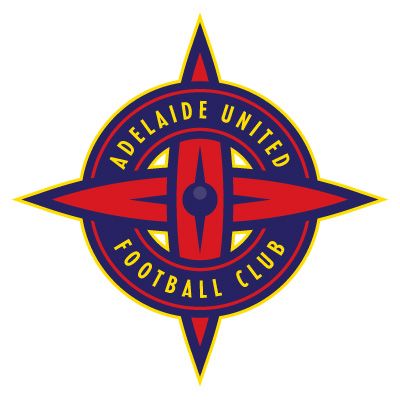
|
|
|
|
|
mowse
|
|
Group: Forum Members
Posts: 14,
Visits: 0
|
I did this PG logo ages ago. At the time it was suggested I could try some better fonts with it - which is a fair call, but I cant be bothered. My only real issue with Perths logo is the off centre ball. I prefer logos that are balanced/centred. 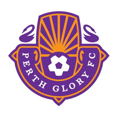
|
|
|
|
|
vanbasten88
|
|
Group: Forum Members
Posts: 2.9K,
Visits: 0
|
mowse wrote:something completely different for Adelaide. the red flowers are 'sturts dessert pea' the SA state flower, and are intertwined with circle to represent 'united'. The cross shape is also a subtle reference to 'city of churches'.  A complete departure from the current logo, but I don't hate it. I'm sorry that that is the most positive I can be:( If my club changed to this, I'd get used to it I guess. But honestly I don't think it's an improvement on our current logo at all.
|
|
|
|
|
samb
|
|
Group: Forum Members
Posts: 2.6K,
Visits: 0
|
Volrath2002 wrote:Wow check this out: Personal project by Flying Pig Productions on a brand redesign for the South Coast Wolves ( Wollongong Wolves ). As this is a possible expansion club for the A-League I thought I would add it in here.  Check out the project development stages here: http://www.flyingpigproductions.com.au/southcoastwolves/They have various versions of the crest as well as kits for the club. Quite interesting really. Loving this; looks a bit cluttered but other than that Id say it surpasses the quality of most the current A-league crests.
|
|
|
|
|
vanbasten88
|
|
Group: Forum Members
Posts: 2.9K,
Visits: 0
|
I hope when Wollongong gets its team, they choose to go with Wollongong, not South Coast. Just my personal preference. Geographic identity over vague area..."South Coast of where? "
|
|
|
|
|
Heineken
|
|
Group: Forum Members
Posts: 49K,
Visits: 0
|
vanbasten88 wrote:I hope when Wollongong gets its team, they choose to go with Wollongong, not South Coast. Just my personal preference. Geographic identity over vague area..."South Coast of where? " I think it'd be best for the area if they refer to themselves as 'Illawarra Wolves'. That way it encompasses the whole Illawarra Escarpment, and like you said isn't vague. "South Coast" could describe the area South of Cronulla right down to the Victorian Border. Base it in Wollongong, but call it the Illawarra Wolves. Better catchment area. 
WOLLONGONG WOLVES FOR A-LEAGUE EXPANSION!

|
|
|
|
|
pv4
|
|
Group: Moderators
Posts: 12K,
Visits: 0
|
Volrath2002 wrote:Central Coast Mariners:  Massive improvement.
|
|
|
|
|
paulbagzFC
|
|
Group: Forum Members
Posts: 44K,
Visits: 0
|
pv4 wrote:Volrath2002 wrote:Central Coast Mariners:  Massive improvement. Needs more stars. -PB
|
|
|
|
|
SocaWho
|
|
Group: Forum Members
Posts: 9.3K,
Visits: 0
|
mowse wrote:I did this PG logo ages ago. At the time it was suggested I could try some better fonts with it - which is a fair call, but I cant be bothered. My only real issue with Perths logo is the off centre ball. I prefer logos that are balanced/centred.  Much better.=d>
|
|
|
|
|
The Frenchman
|
|
Group: Forum Members
Posts: 1.5K,
Visits: 0
|
Heineken wrote:vanbasten88 wrote:I hope when Wollongong gets its team, they choose to go with Wollongong, not South Coast. Just my personal preference. Geographic identity over vague area..."South Coast of where? " I think it'd be best for the area if they refer to themselves as 'Illawarra Wolves'. That way it encompasses the whole Illawarra Escarpment, and like you said isn't vague. "South Coast" could describe the area South of Cronulla right down to the Victorian Border. Base it in Wollongong, but call it the Illawarra Wolves. Better catchment area.  Couldn't agree more! Ive been saying this for years, forget Wollongong, its too specific, and South Coast is not specific enough. To be honest anyone outside of the Illawarra area isn't going to travel for a game anyway. I know wed all like to think there are thousands of rural supporters flooding in to games on weekends but it just isn't so. If you have to travel for more than an hour, chances are you won't go to the match. Of course die hards will always travel from wherever to wherever, but they don't make up the core numbers. Illawarra also inconsequently starts with a letter we don't have already and brings more difference in team abbreviations. Id hate to see WSW v WW and such. Seeing as we have 2 teams alreadys beginning with W a third is maybe too much.
|
|
|
|
|
A16Man
|
|
Group: Forum Members
Posts: 5.2K,
Visits: 0
|
Wollongong Wolves sounds better. Dat alliteration!
|
|
|
|
|
toffeeAU
|
|
Group: Forum Members
Posts: 1.4K,
Visits: 0
|
pv4 wrote:Volrath2002 wrote:Central Coast Mariners:  Massive improvement.
|
|
|
|
|
SocaWho
|
|
Group: Forum Members
Posts: 9.3K,
Visits: 0
|
Wollongong Wolverines.
|
|
|
|
|
SocaWho
|
|
Group: Forum Members
Posts: 9.3K,
Visits: 0
|
mowse wrote:something completely different for Adelaide. the red flowers are 'sturts dessert pea' the SA state flower, and are intertwined with circle to represent 'united'. The cross shape is also a subtle reference to 'city of churches'.  Looks good. Maybe Adelaide can make this the logo and hand out ninja stars to fans in the form of the club logo.:lol:
|
|
|
|
|
A16Man
|
|
Group: Forum Members
Posts: 5.2K,
Visits: 0
|
SocaWho wrote:Wollongong Wolverines. 
|
|
|
|
|
SocaWho
|
|
Group: Forum Members
Posts: 9.3K,
Visits: 0
|
A16Man wrote:SocaWho wrote:Wollongong Wolverines.  Right uniform ...wrong team.:lol:
|
|
|
|
|
Volrath2002
|
|
Group: Forum Members
Posts: 903,
Visits: 0
|
samb wrote:Volrath2002 wrote:Wow check this out: Personal project by Flying Pig Productions on a brand redesign for the South Coast Wolves ( Wollongong Wolves ). As this is a possible expansion club for the A-League I thought I would add it in here. Check out the project development stages here: http://www.flyingpigproductions.com.au/southcoastwolves/They have various versions of the crest as well as kits for the club. Quite interesting really. Loving this; looks a bit cluttered but other than that Id say it surpasses the quality of most the current A-league crests. They actually did make a simplier version with Wollongong instead of South Coast after some community feedback  "Due to concerns of the crest/logo being too busy, we made some minor changes to try to simplify the crest. We removed the Star of the NSW flag as this could be confused with stars that are used by European teams to signify wins in the Champions League, or wins in the World Cup by National teams. We also removed the 'year', moved the NSW Gov logo to replace the star and repositioned some elements. We also tried out using "Wollongong" instead of "South Coast" as it is more traditional and rolls off the tounge better." "Due to concerns of the crest/logo being too busy, we made some minor changes to try to simplify the crest. We removed the Star of the NSW flag as this could be confused with stars that are used by European teams to signify wins in the Champions League, or wins in the World Cup by National teams. We also removed the 'year', moved the NSW Gov logo to replace the star and repositioned some elements. We also tried out using "Wollongong" instead of "South Coast" as it is more traditional and rolls off the tounge better."I think the name of the club is interesting as traditionally it would be Wollongong, currently it is South Coast but it consists of all the Illawarra so really it could be any of them. From what I understand the reason for the change currently in 2013 was the old Wollongong Wolves ( formally Wollongong City FC ) went bust and the current club in technical terms is a phoenix club, I could be wrong about this but that is what I have been told. As for the concerns about the name of South Coast it is no more confusing than Central Coast, but with the crest design they have tried to incorporate the NSW waratah as a symble to where the club comes from.
Canberra United - Member
KSV Hessen Kassel - Supporter
Lewes FC - Owner
|
|
|
|
|
Volrath2002
|
|
Group: Forum Members
Posts: 903,
Visits: 0
|
mowse wrote:something completely different for Adelaide. the red flowers are 'sturts dessert pea' the SA state flower, and are intertwined with circle to represent 'united'. The cross shape is also a subtle reference to 'city of churches'.  Both your Adelaide and Perth designs are really good. I like both of them. Something different to what is currently used yet both incorperate state icons and a sence of identity.
Canberra United - Member
KSV Hessen Kassel - Supporter
Lewes FC - Owner
|
|
|
|
|
Volrath2002
|
|
Group: Forum Members
Posts: 903,
Visits: 0
|
That's not to bad either. nice and simple with a much stronger link to the correct Adelaide United crest. Would it be worth trying to reverse the colours a little to make it a little more red?
Canberra United - Member
KSV Hessen Kassel - Supporter
Lewes FC - Owner
|
|
|
|
|
montywoodpeg
|
|
Group: Forum Members
Posts: 349,
Visits: 0
|
Volrath2002 wrote:Would it be worth trying to reverse the colours a little to make it a little more red? Sometimes having a crest that contrasts well with the jersey works quite well. Would also still be interested in seeing a reverse version, though.
|
|
|
|
|
Volrath2002
|
|
Group: Forum Members
Posts: 903,
Visits: 0
|
montywoodpeg wrote:Volrath2002 wrote:Would it be worth trying to reverse the colours a little to make it a little more red? Sometimes having a crest that contrasts well with the jersey works quite well. Would also still be interested in seeing a reverse version, though. Good point. Are there any Sydney FC fans out there? What would you like to see as part of a Sydney crest if one was to be designed? I've seen a few different designs on the Sydney forum with three general themes 1. Nautical ( ships, anchors etc ) 2. 'The Cove' crest as a basis 3. Monograms are very fashionable right now    
Canberra United - Member
KSV Hessen Kassel - Supporter
Lewes FC - Owner
|
|
|
|